In this electronic supplement, we provide the final P-velocity model, the smoothing and damping trade-off analysis, the a priori Moho depth, resolution tests, map-view slices and cross-sections through the 3D Vp and Vs models that are not included in the manuscript.
Final P-velocity model in our study.
Table S1. Comparison of models with and without the inclusion of a Moho interface — (1) for with Moho model and (2) for without Moho model. The velocities are the layer-average values computed over well-resolved areas for the depths shown in the first column.
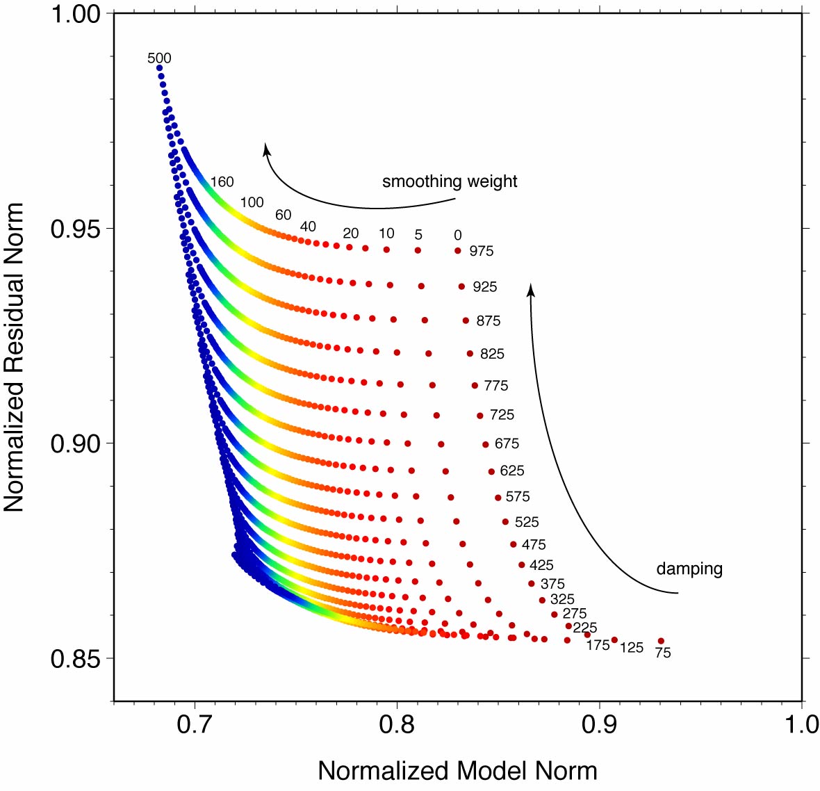
Figure S1. Tradeoff curve between data misfit and model variance for Vp model.
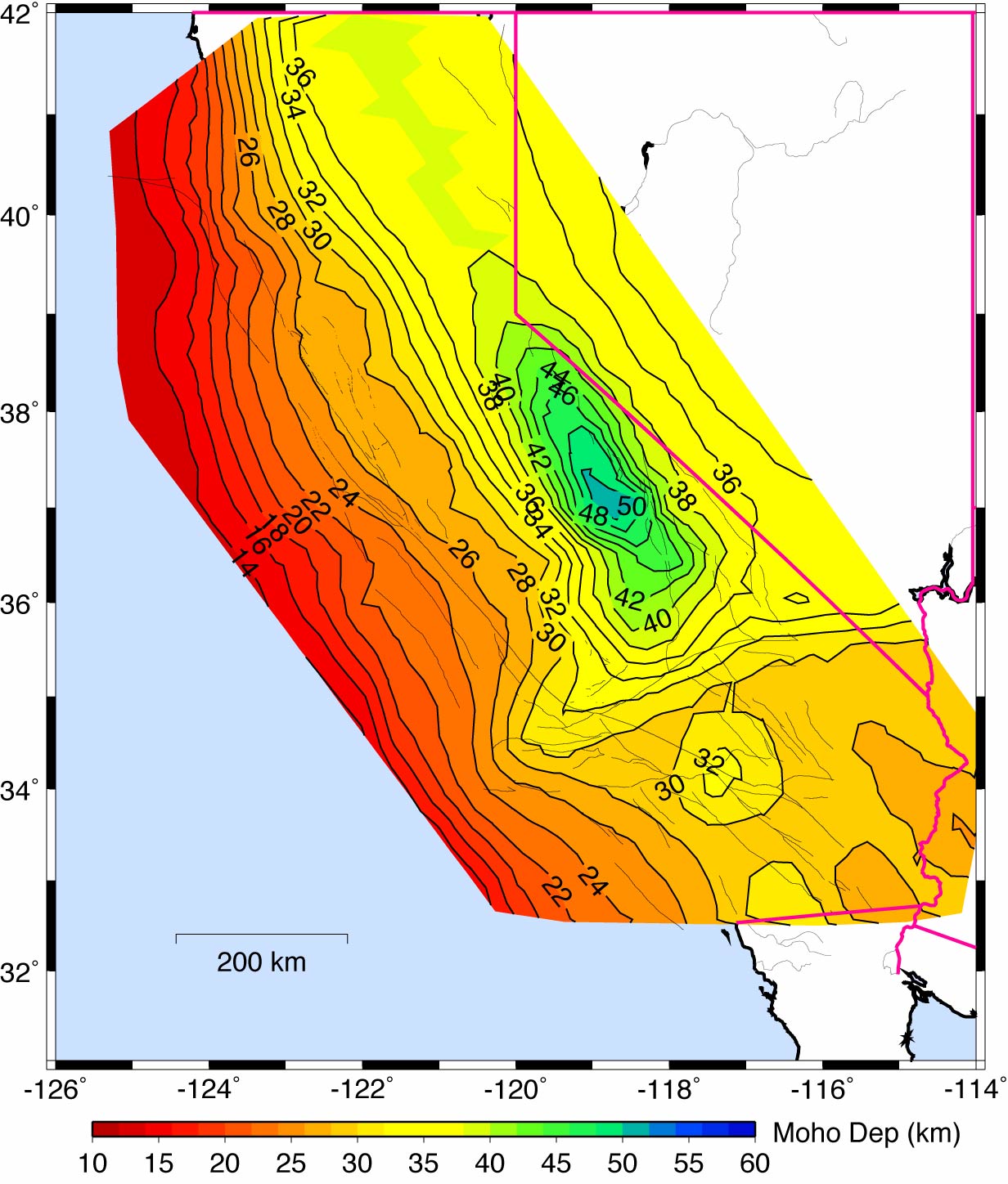
Figure S2. A priori Moho depth for California used in our study modified from the results by Fuis and Mooney (1990). The thick pink line marks the state and country boundaries.
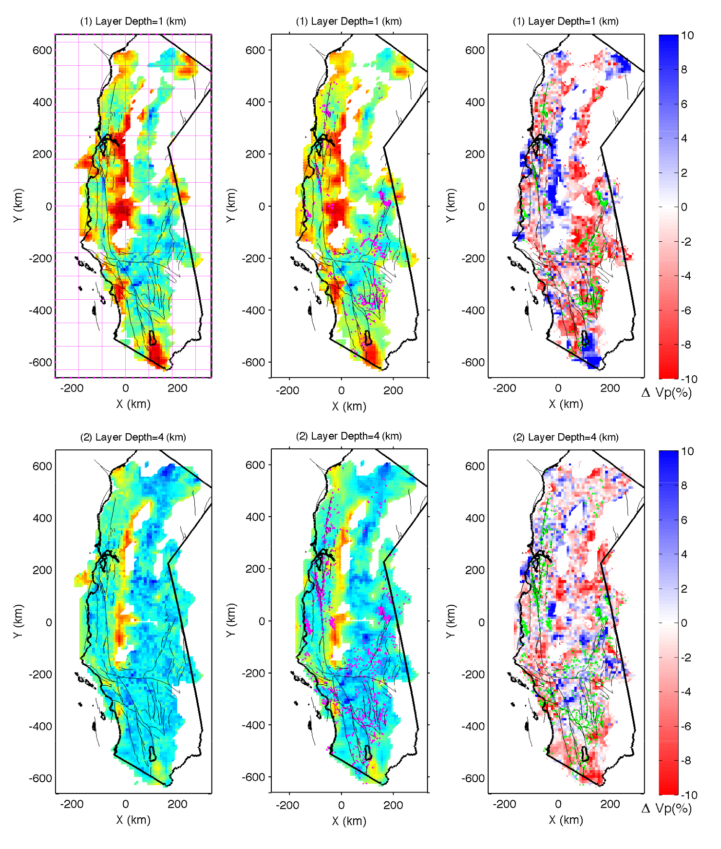
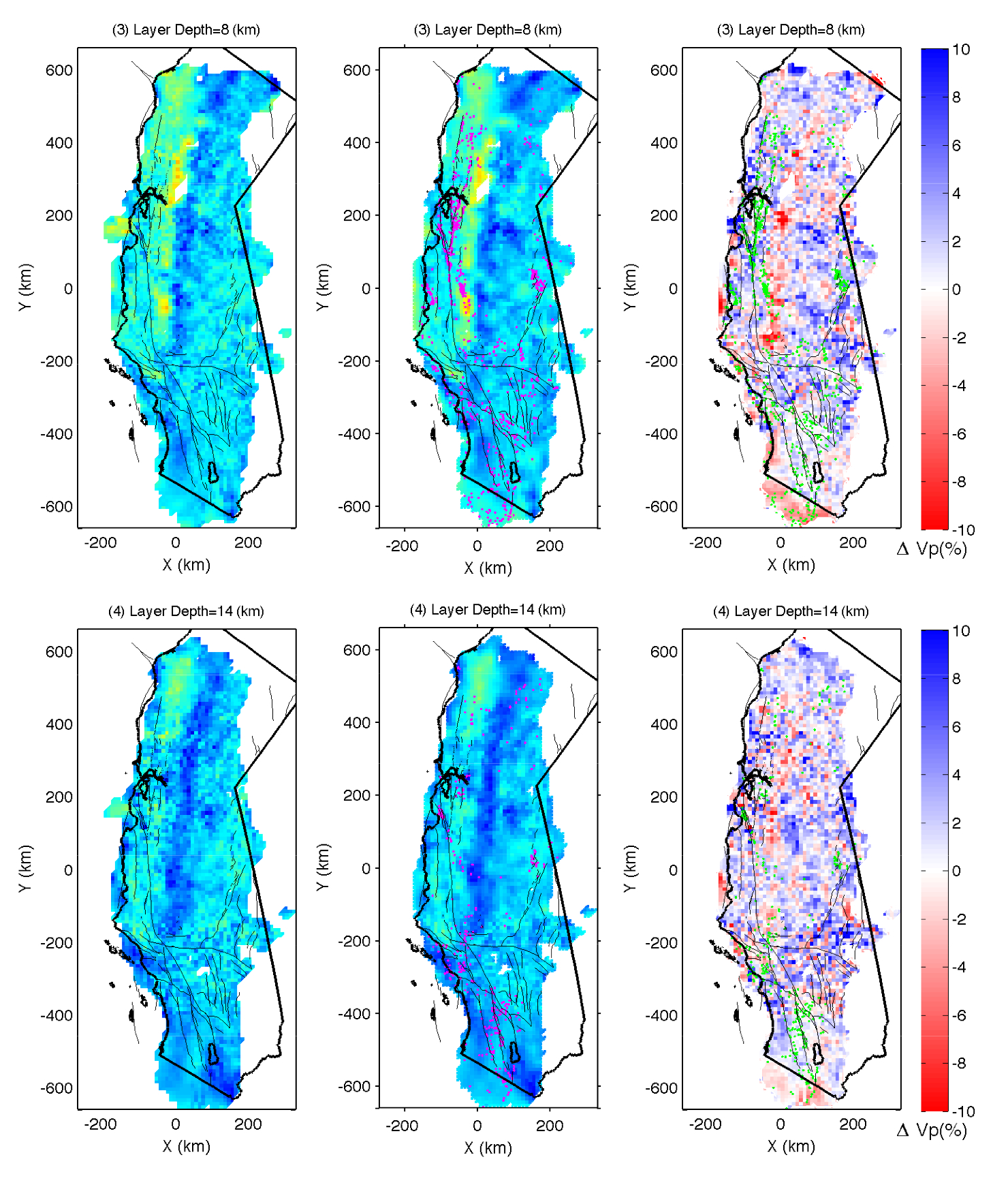
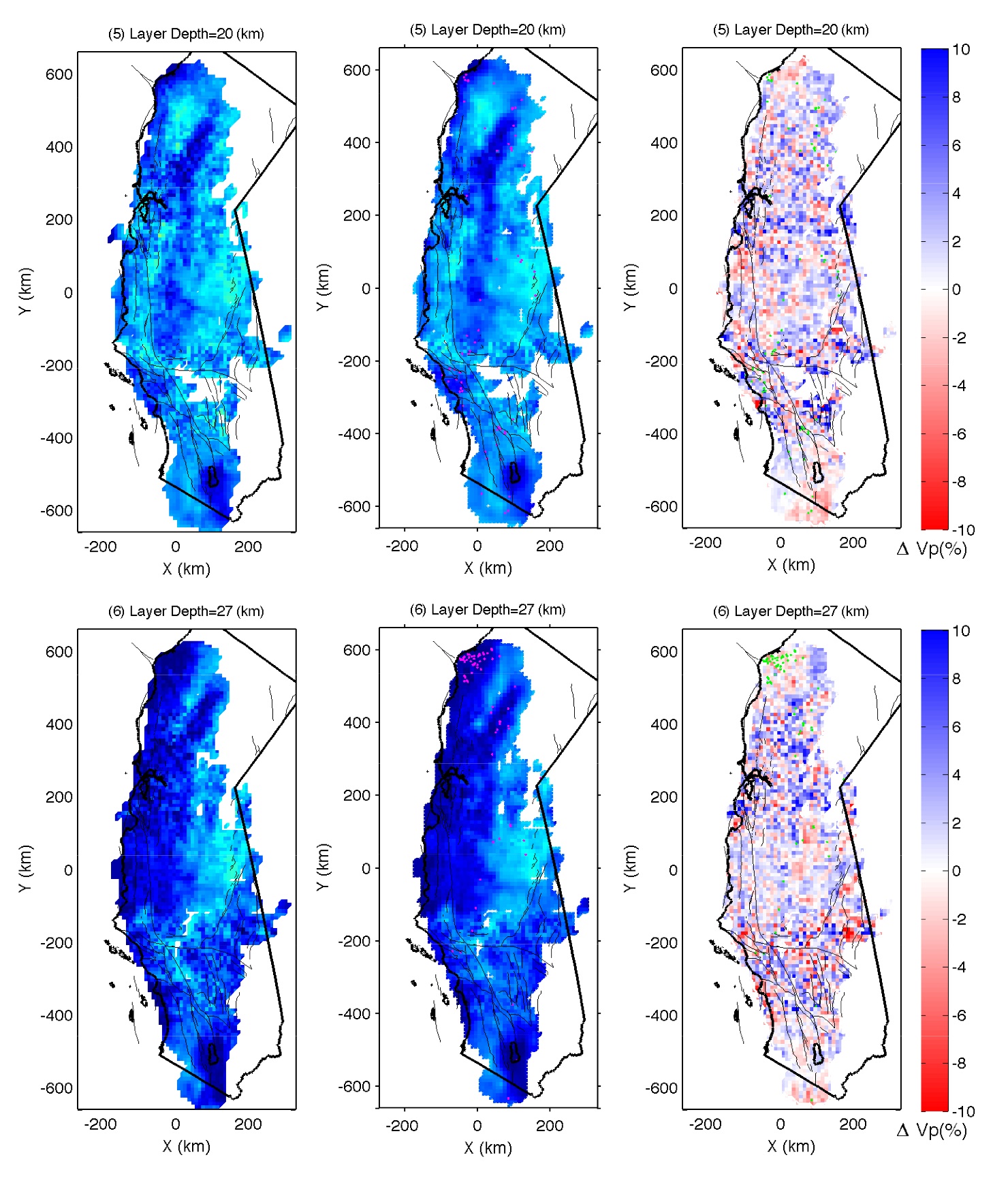
Figure S3. Restoration test, in which event hypocenters, station locations and synthetic travel times,
calculated from our final model, have the same distribution as the real data. First column shows our final model,
which is the "real" model in this test. The last two columns show the inverted model and model perturbations
relative to the real model, respectively. Only well-resolved areas, where the derivative weight sum is greater
than 300, are shown. Green dots in the middle column and pink dots in the right column represent relocated
earthquakes. Black lines denote coast line and lakes, gray lines rivers and surface traces of mapped faults.
Pink lines in (1) show the depth profiles for the following cross section views.
(1)
(2)
(3)
(4)
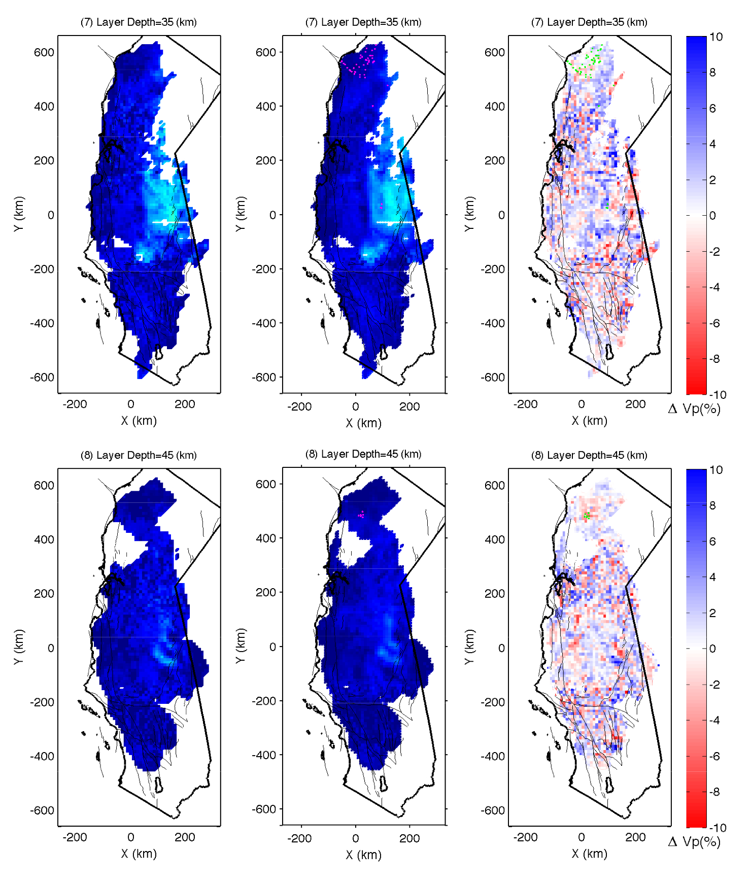
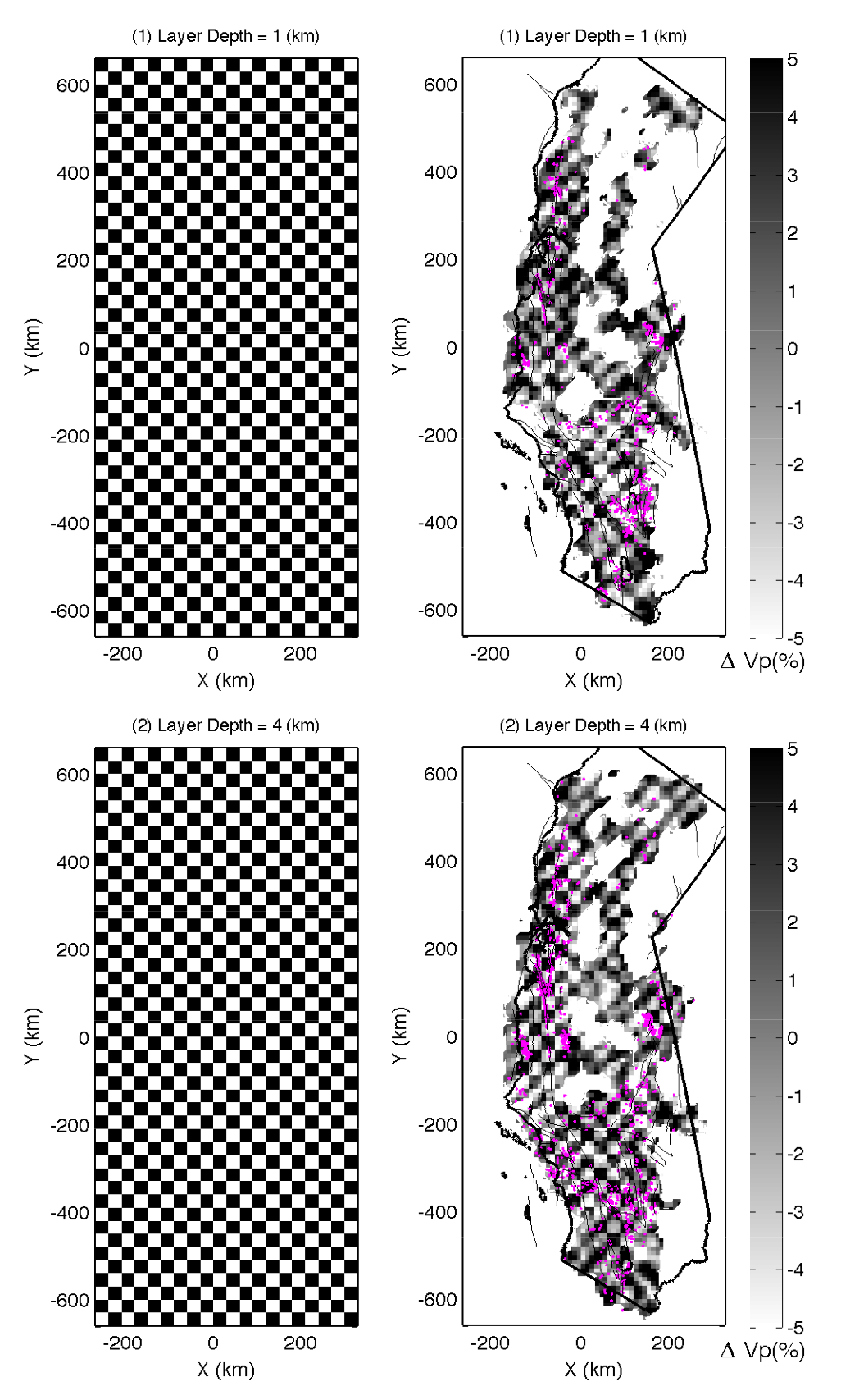
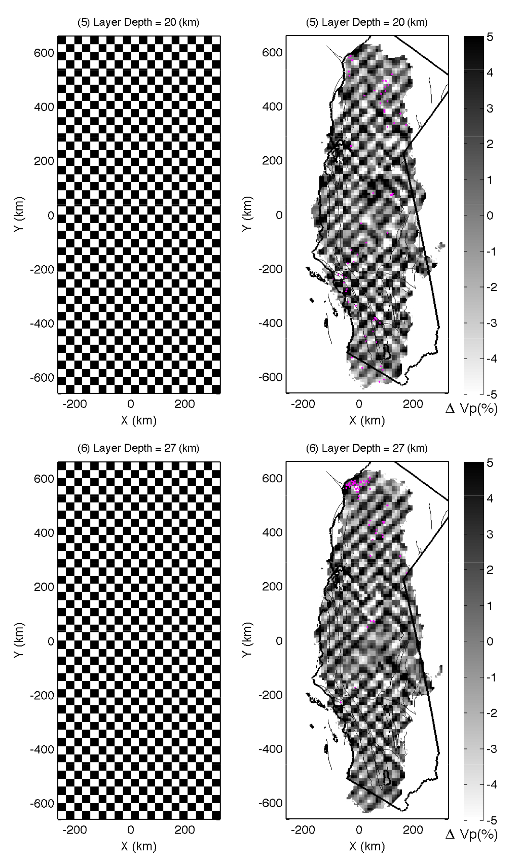
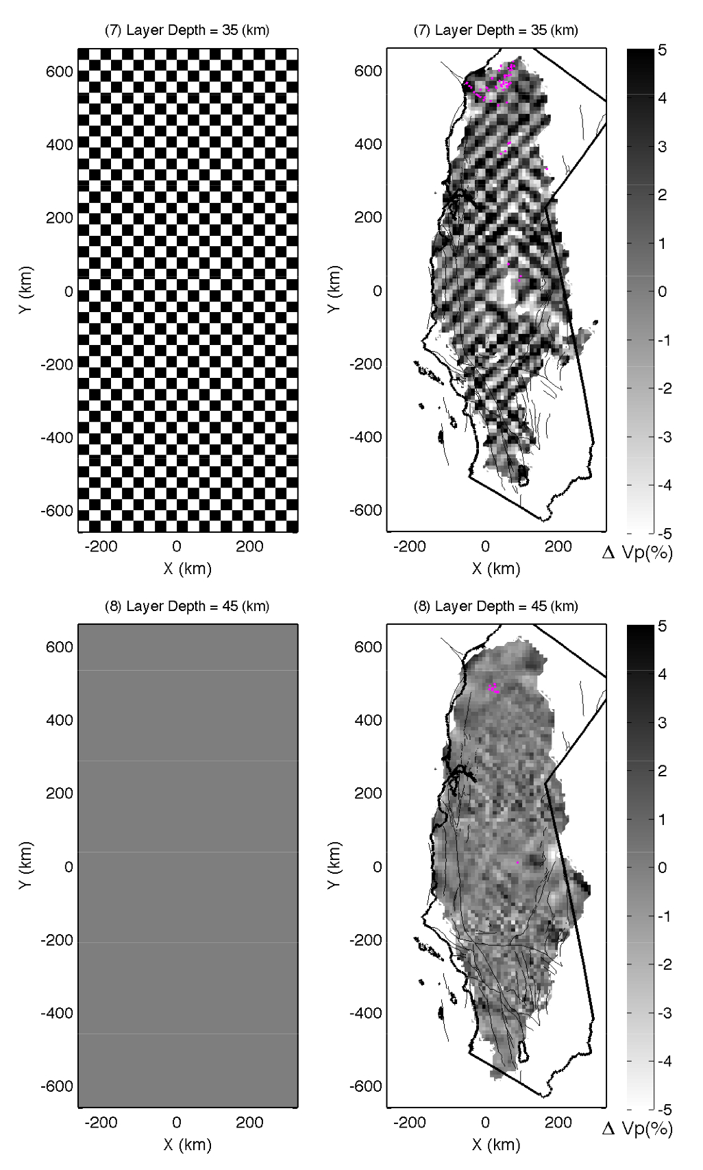
Figure S4. Checkerboard test, in which the synthetic times are computed through the 1D starting velocity
model with +/-5% velocity anomalies across three grid nodes. Only well-resolved areas, where the derivative weight
sum is greater than 300, are shown. Pink dots represent relocated earthquakes. Black lines denote coast line and lakes,
gray lines rivers and surface traces of mapped faults.
(1)
(2)
(3)
(4)
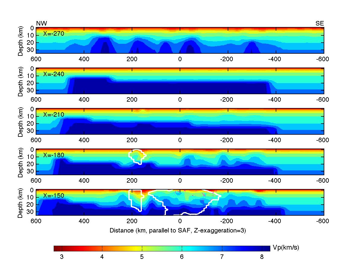
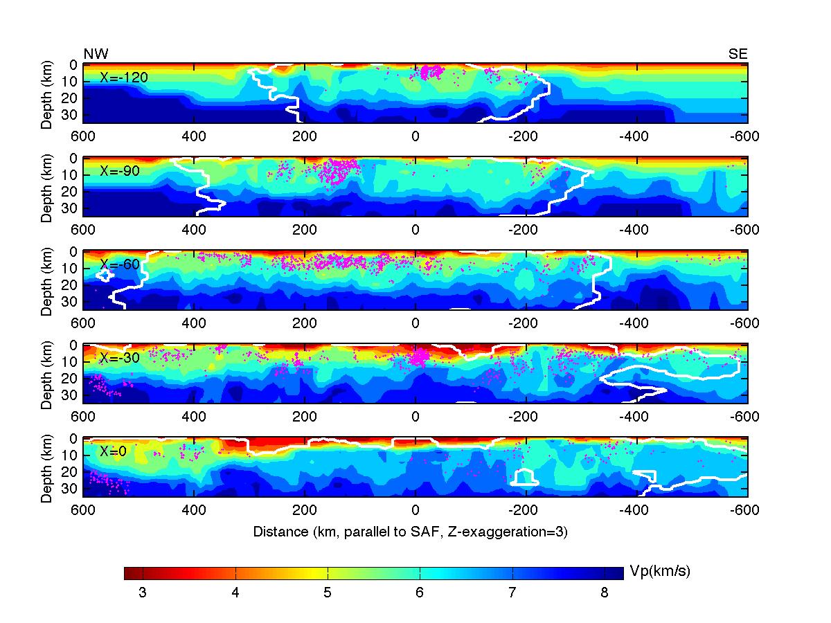
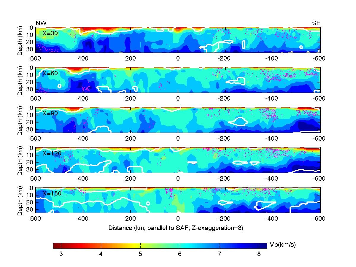
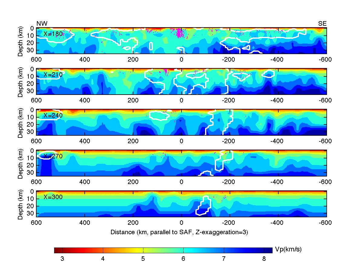
Figure S5. Cross-sections of the absolute P-wave velocity along profiles parallel to the San Andreas Fault.
The white contours enclose the areas where the derivative weight sum is greater than 300. Locations of the cross-section
profiles can be found in Figure ES3(1). Pink dots represent relocated earthquakes.
(1)
(2)
(3)
(4)
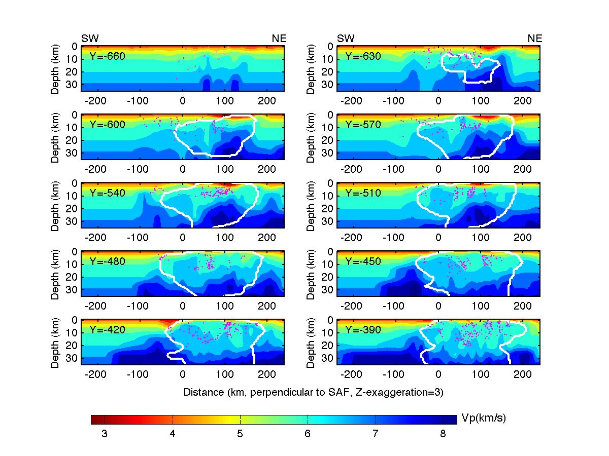
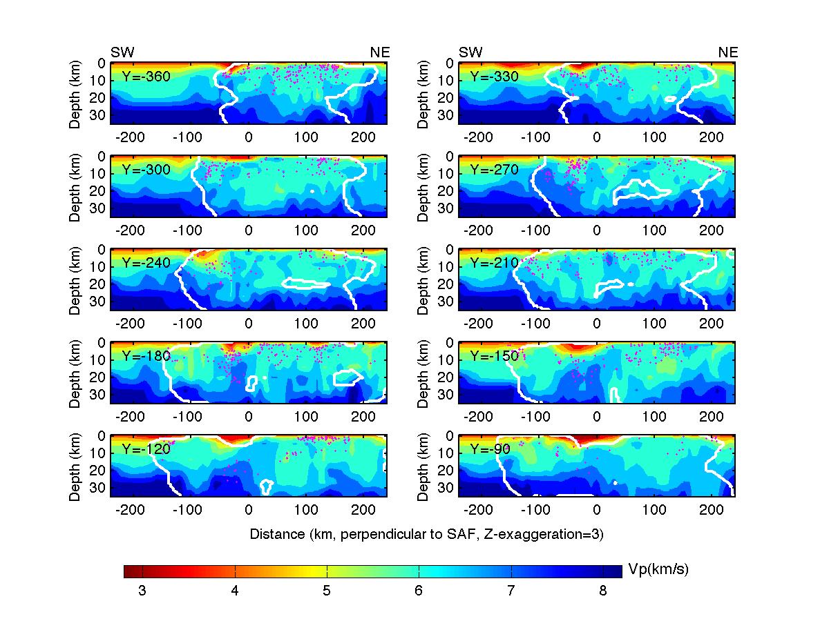
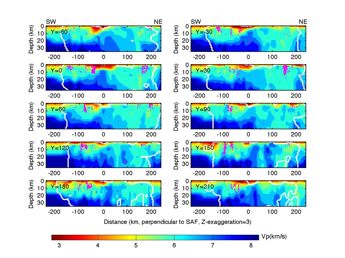
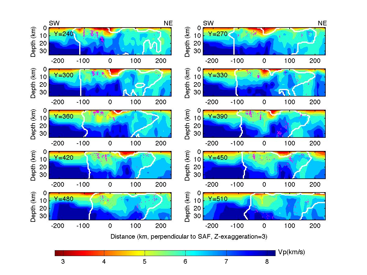
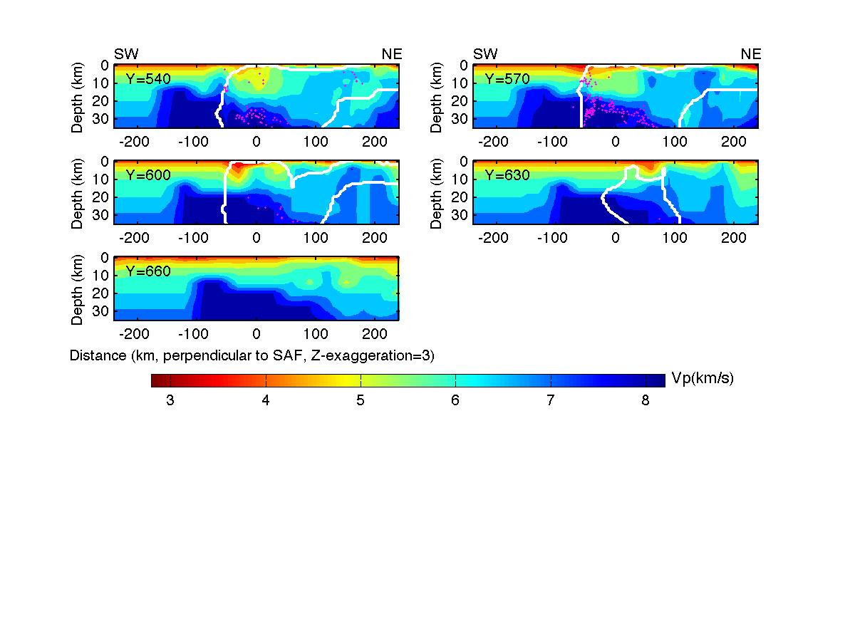
Figure S6. Cross-sections of the absolute P-wave velocity along profiles perpendicular to the San Andreas Fault.
The white contours enclose the areas where the derivative weight sum is greater than 300. Locations of the cross-section
profiles are shown in Figure ES3(1). Pink dots represent relocated earthquakes.
(1)
(2)
(3)
(4)
(5)
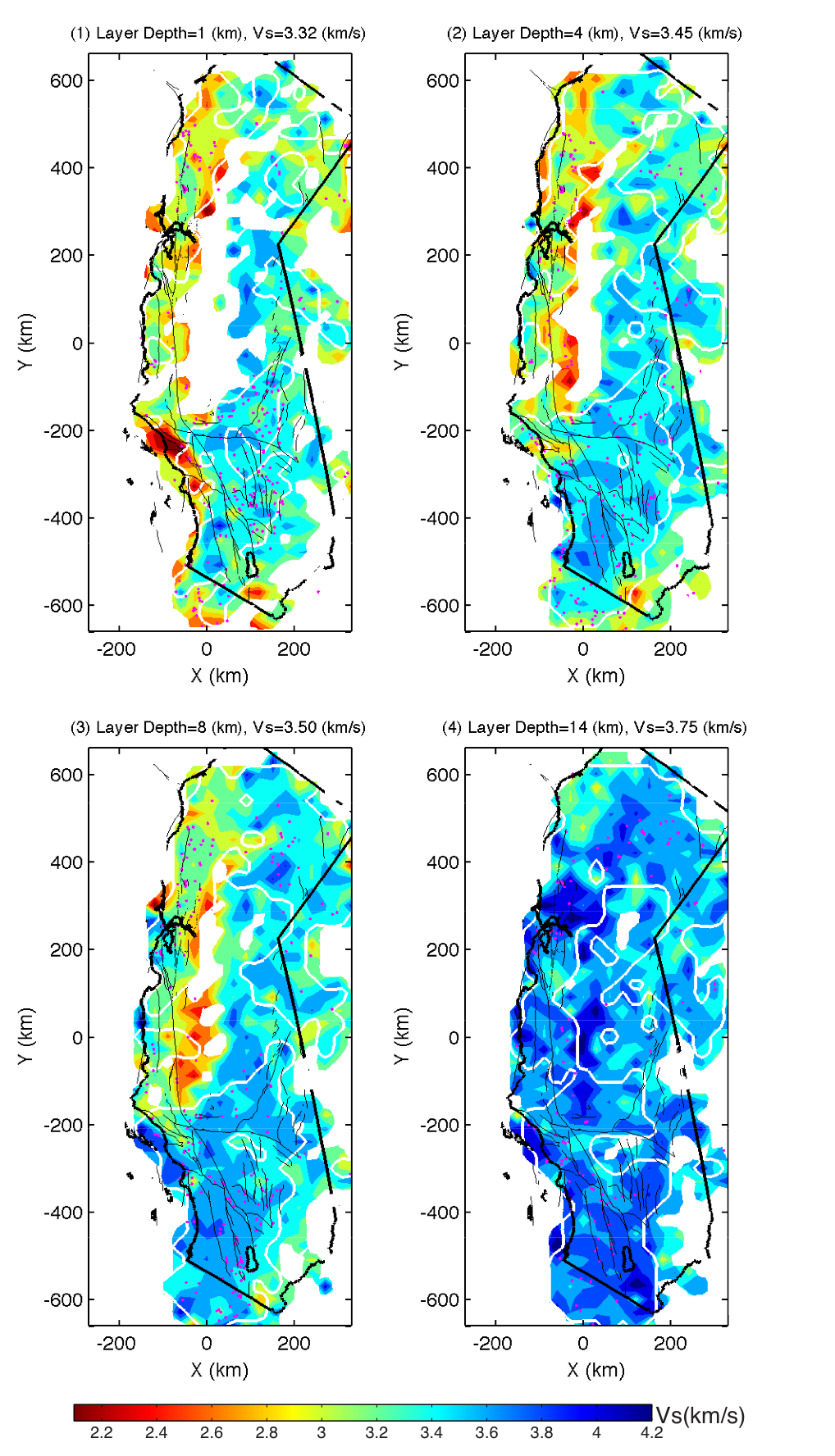
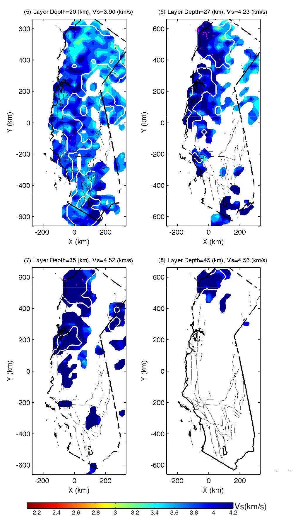
Figure S7. Map views of the resolved S-wave velocity model at different depth slices.
Pink dots represent relocated earthquakes. Black lines denote coast line and lakes,
gray lines rivers and surface traces of mapped faults. The white contours enclose the areas
where the derivative weight sum is greater than 100.
(a)
(b)
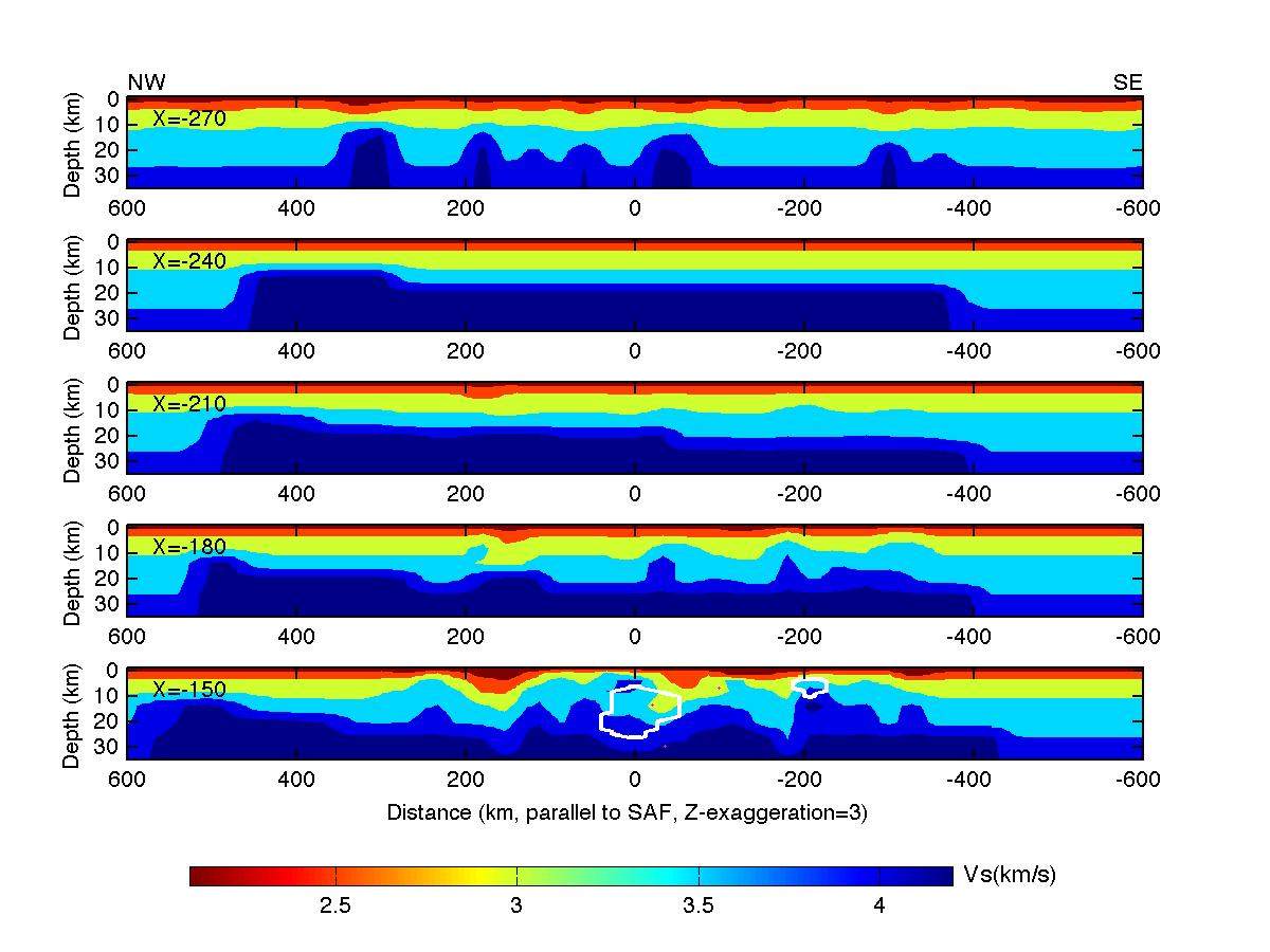
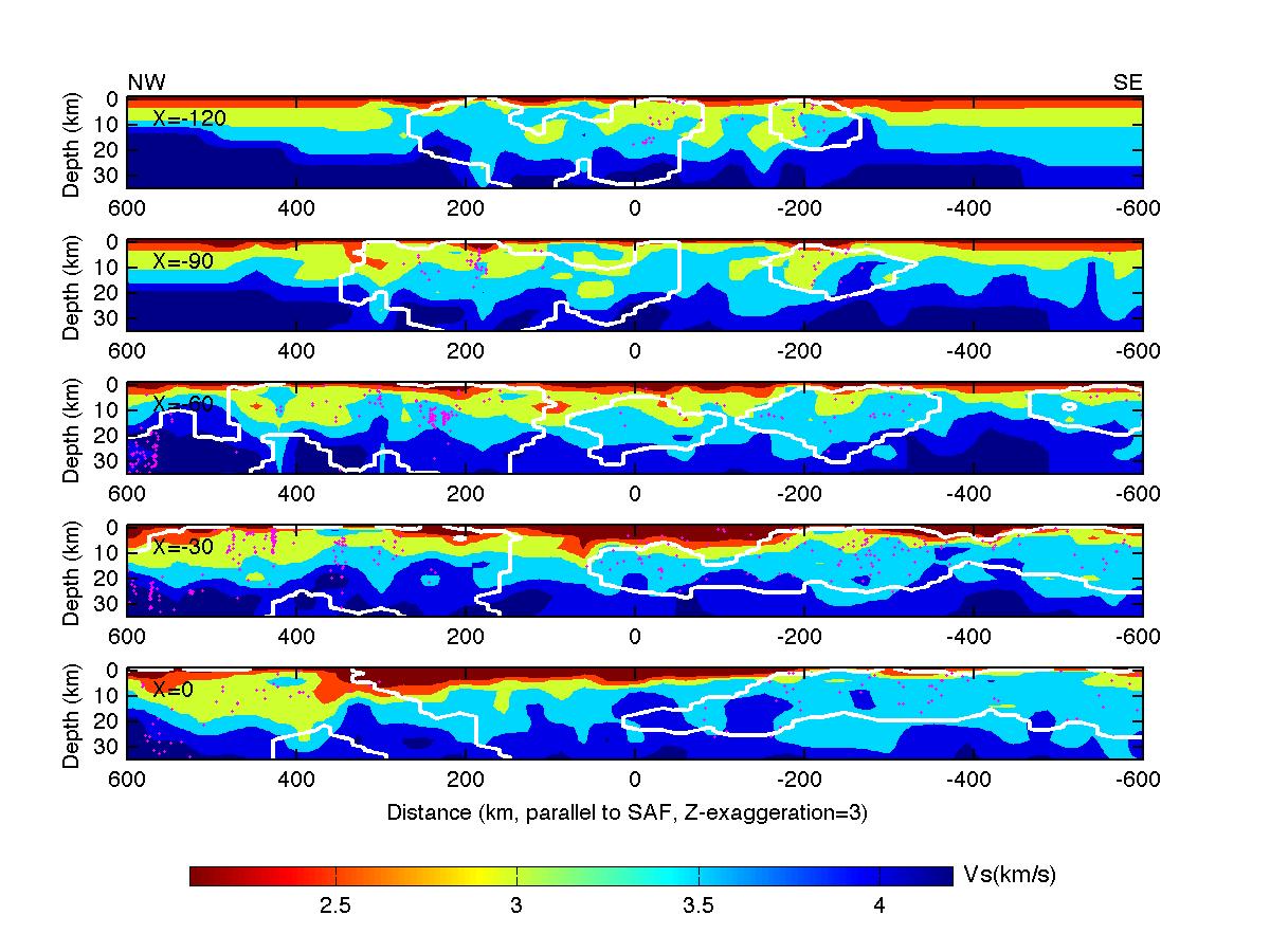
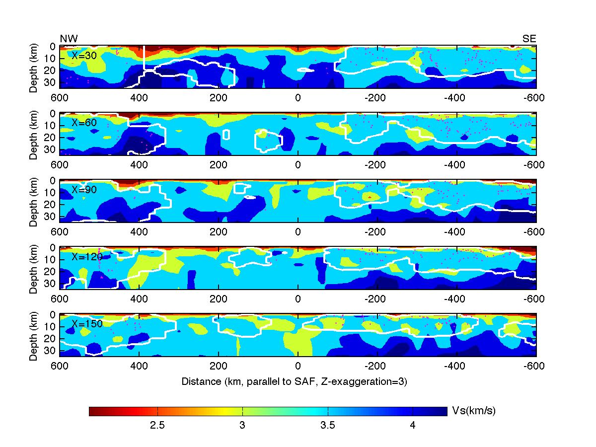
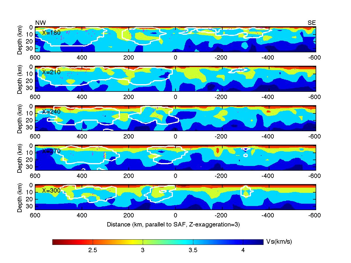
Figure S8. Cross-sections of the absolute S-wave velocity along profiles parallel to the San Andreas Fault.
The white contours enclose the areas where the derivative weight sum is greater than 100. Locations of the cross-section
profiles are shown in Figure ES3(1). Pink dots represent relocated earthquakes.
(1)
(2)
(3)
(4)
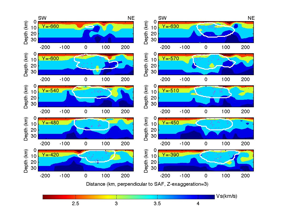
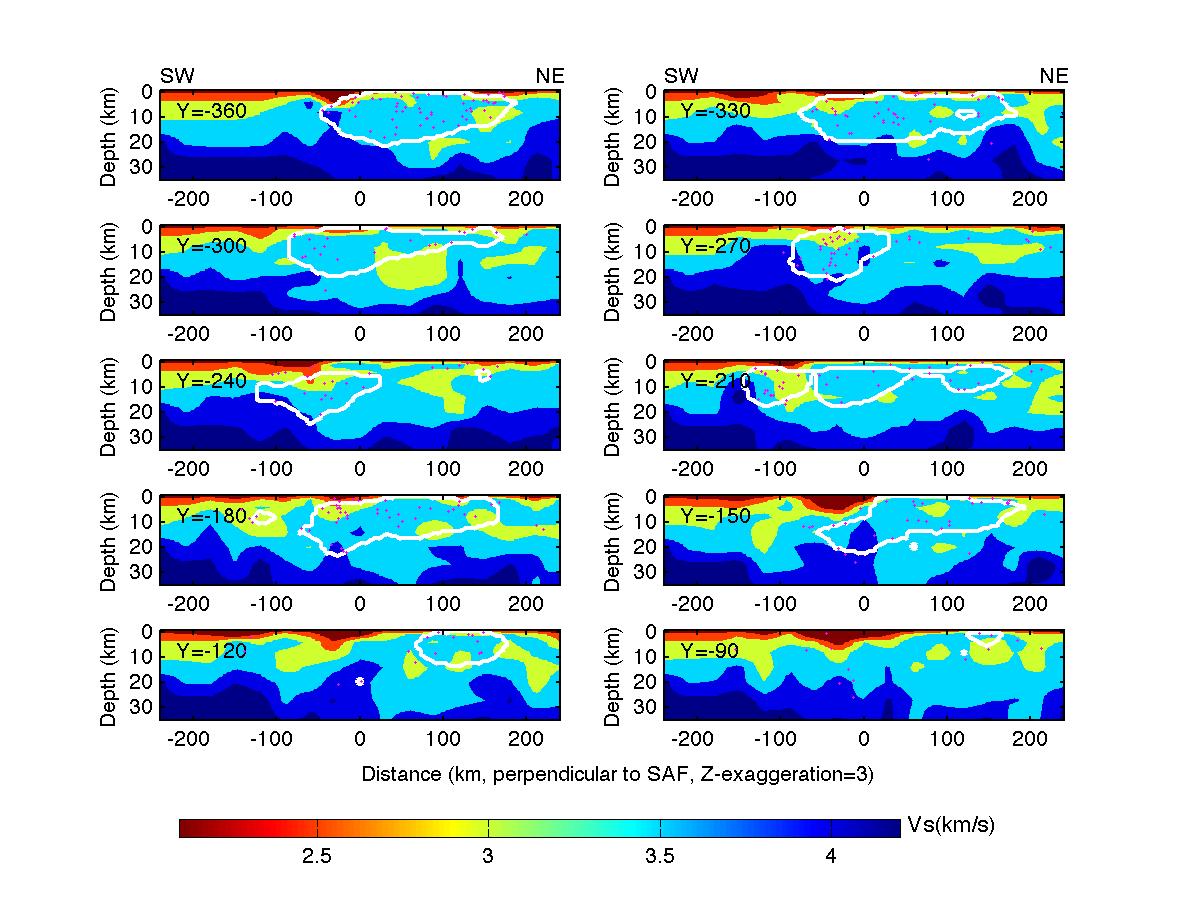
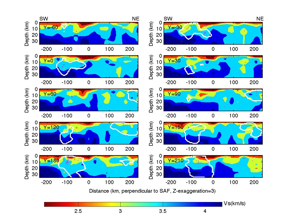
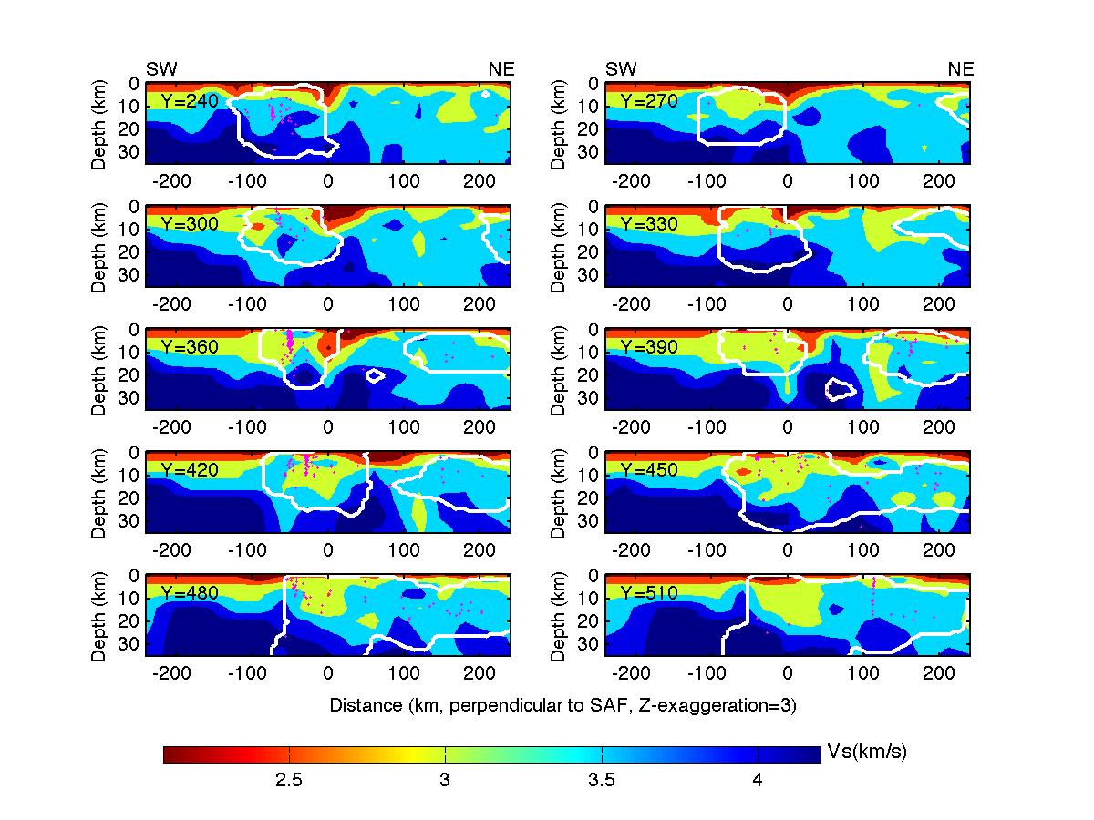
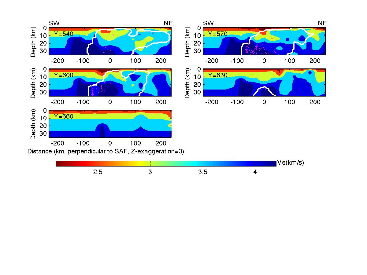
Figure S9. Cross-sections of the absolute S-wave velocity along profiles perpendicular to the San Andreas Fault.
The white contours enclose the areas where the derivative weight sum is greater than 100. Locations of the cross-section
profiles are shown in Figure ES3(1). Pink dots represent relocated earthquakes.
(1)
(2)
(3)
(4)
(5)