All 34 figures here are provided in order to allow more examples of the plots shown in the paper itself to be seen and/or to allow closer examination of some of the figures that cannot be presented with adequate detail in the paper itself.
Figure S1. Space-time plots for AllCAL simulator, namely a graphical catalog of events, showing timing and sizes of earthquakes for all modeled fault sections. This is shown in the paper itself, but here can be enlarged to see more detail. Figures S2-S4 show similar plots for the other three simulators.
Figure S2. Same as Figure S1, but for VIRTCAL simulator.
Figure S3. Same as Figure S1, but for RSQSim simulator.
Figure S4. Same as Figure S1, but for ViscoSim simulator.
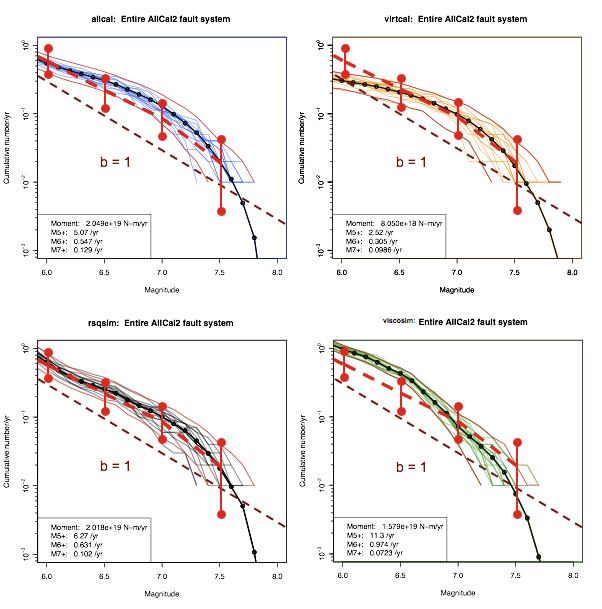
Figure S5. Frequency-magnitude plot for 4 earthquake simulators compared with observations in red (Figure 15 of Field et al. [2008]), but unlike the average shown in Figure 3 of the paper itself, this shows results for 15 different randomly selected 100 year periods out of the total simulated time.
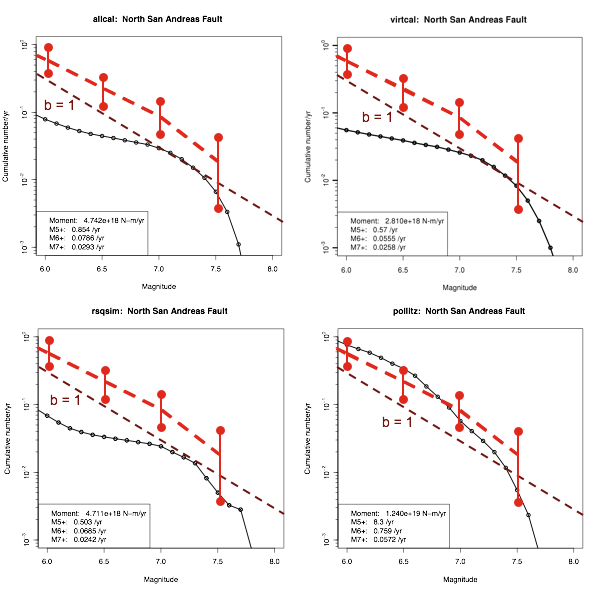
Figure S6. Frequency-magnitude plot for 4 earthquake simulators for Northern San Andreas Fault. The observed Frequency-magnitude plot in red (Figure 15 of Field et al. [2008]) is shown only for reference, since it represents results for the entire state. This and the other single-fault frequency-magnitude plots of Figures S7 and S8 show that the number of events of M7 and smaller is more reduced than at M7.5 when compared to the entire data set shown in Figure 3 of the paper itself. Thus, these plots show that the events on these faults are in some sense more characteristic than is the distribution when all the faults in the system are included.
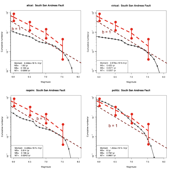
Figure S7. Same as Figure S6, but for the Southern San Andreas Fault.
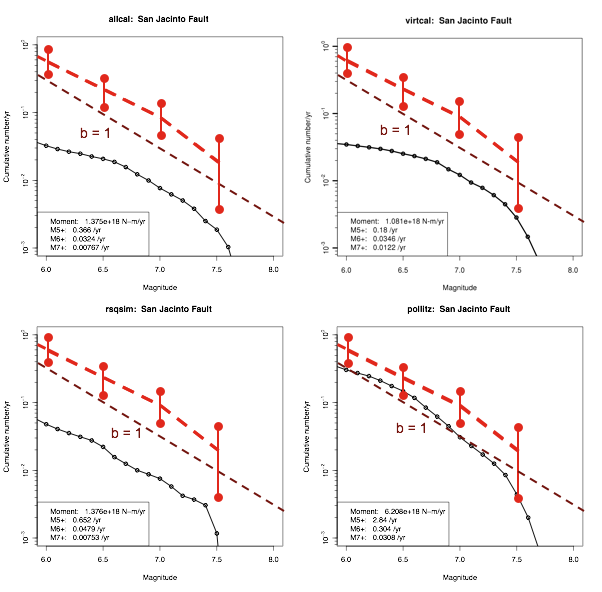
Figure S8. Same as Figure S6, but for the San Jacinto Fault.
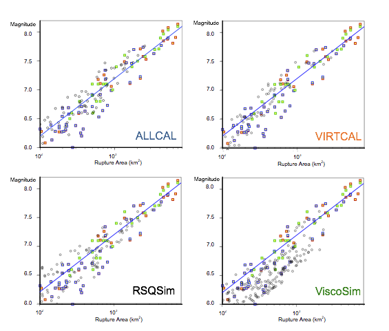
Figure S9. Scaling of magnitude vs. rupture area, but for only 200 years of simulated time. Our simulated values in black are shown with observed scaling relations shown in colors: blue [Wells and Coppersmith, 1994], green [Ellsworth, 2003], and red [Hanks and Bakun, 2002]. Comparing only 200 years of simulated seismicity here, rather than 30,000 years as shown in Figure 7 in the paper itself, shows scatter more similar to the observations.
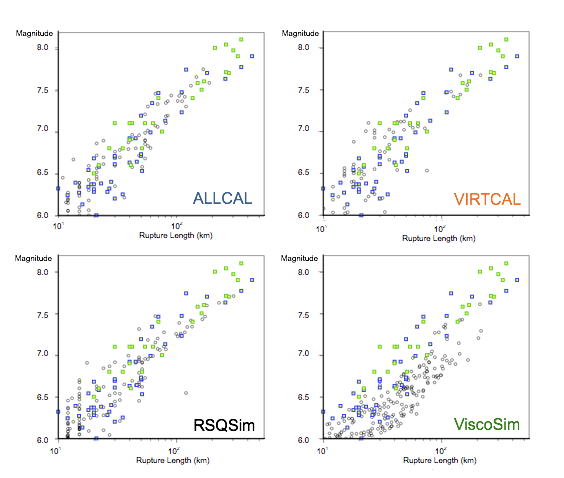
Figure S10. Scaling of magnitude vs. rupture length, but for only 200 years of simulated time. Our simulated values in black are shown with observed scaling relations shown in colors: blue [Wells and Coppersmith, 1994] and green [Ellsworth, 2003]. Comparing only 200 years of simulated seismicity here, rather than 30,000 years as shown in Figure 8 in the paper itself, shows scatter more similar to the observations.
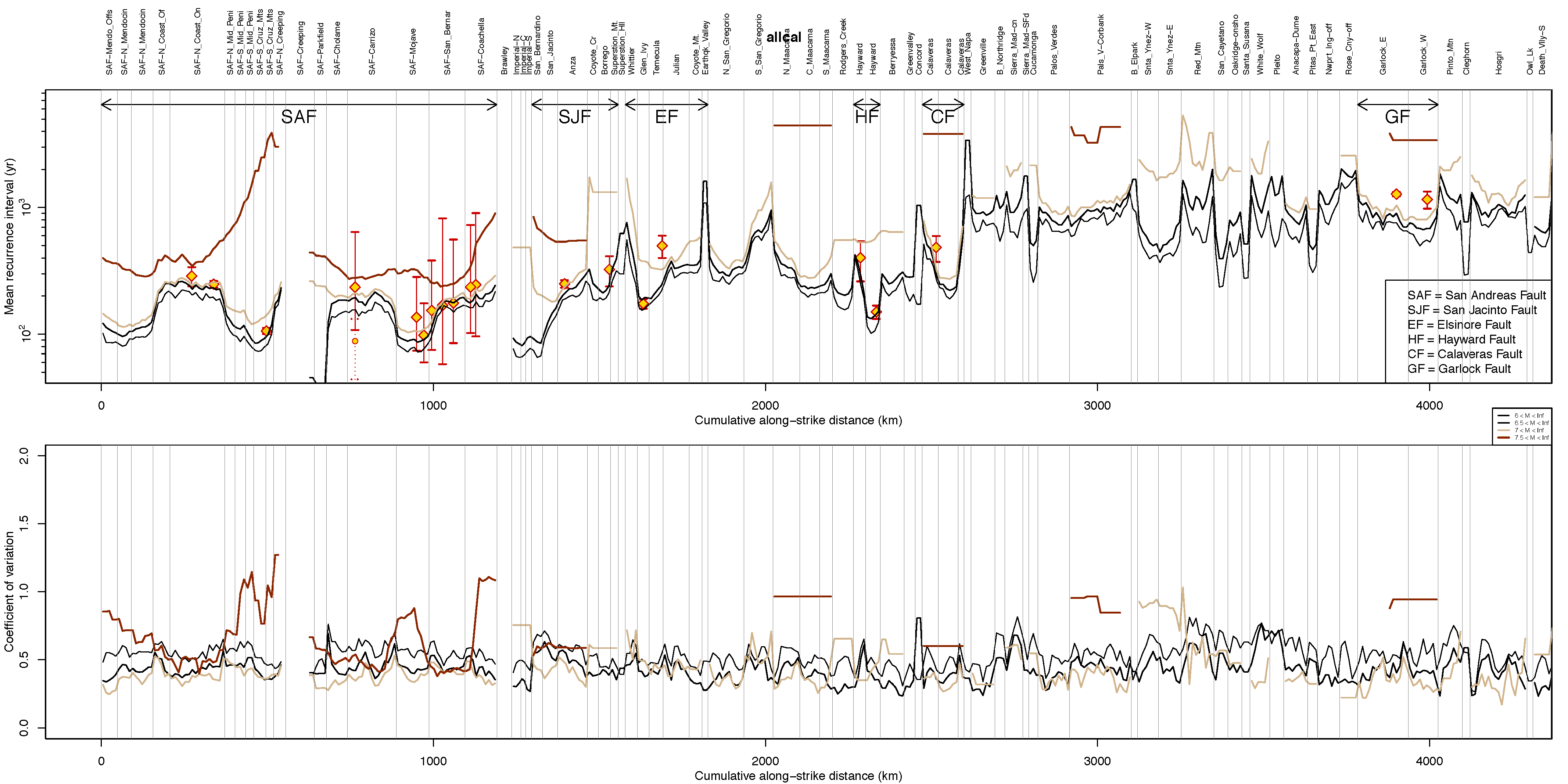
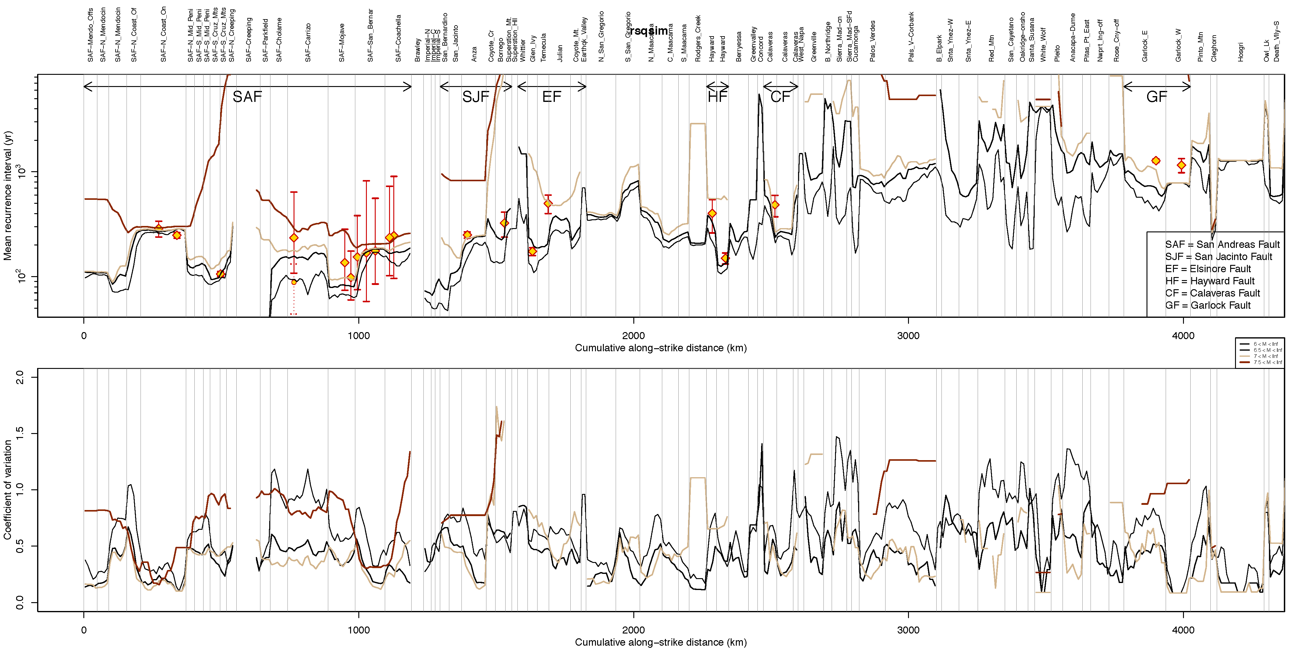
Figure S11. Mean (A) and covariance (B) of interevent times arranged by section for the major faults. These data are for the ALLCAL simulator and this is the same as Figure 19 in the paper itself, but can be enlarged so it is easier to read. The line colors correspond to the magnitude range as shown in the key and the faults to which the plotted fault sections belong are also indicated in the key, e.g., SAF. For sites having paleoseismic data on recurrence intervals, the preferred value (RI) from the UCERF2 report, Appendix C, Table 5 [Field et al., 2008] is shown as a diamond and the bars show their Table 5 RI "Max" and "Min." Examples of the probability distribution functions for recurrence intervals are shown in Figure 10 of the paper itself and the electronic supplement shows them as Figures S15-S30 for all 23 sites having paleoseismic data for all four simulators.
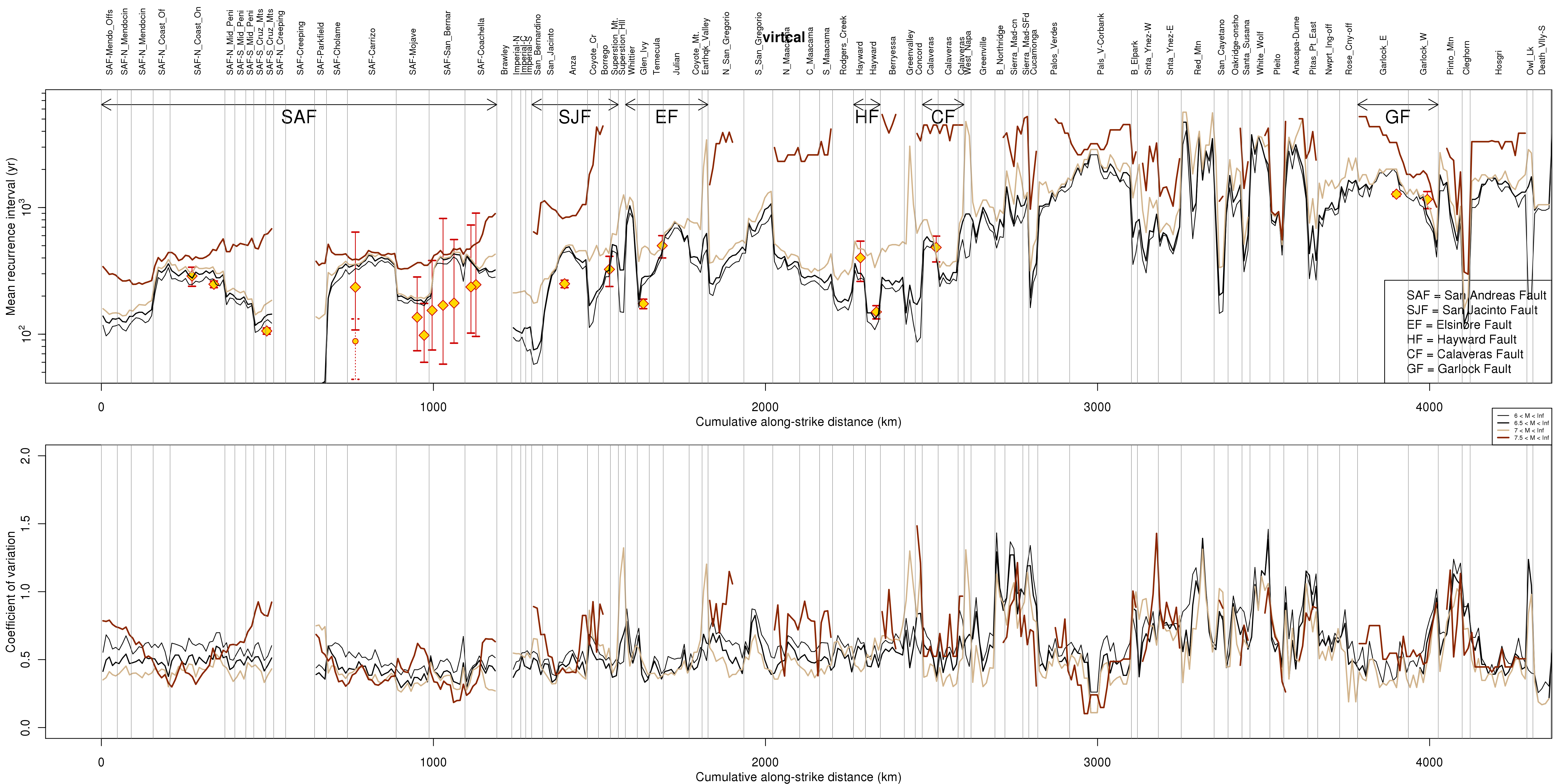
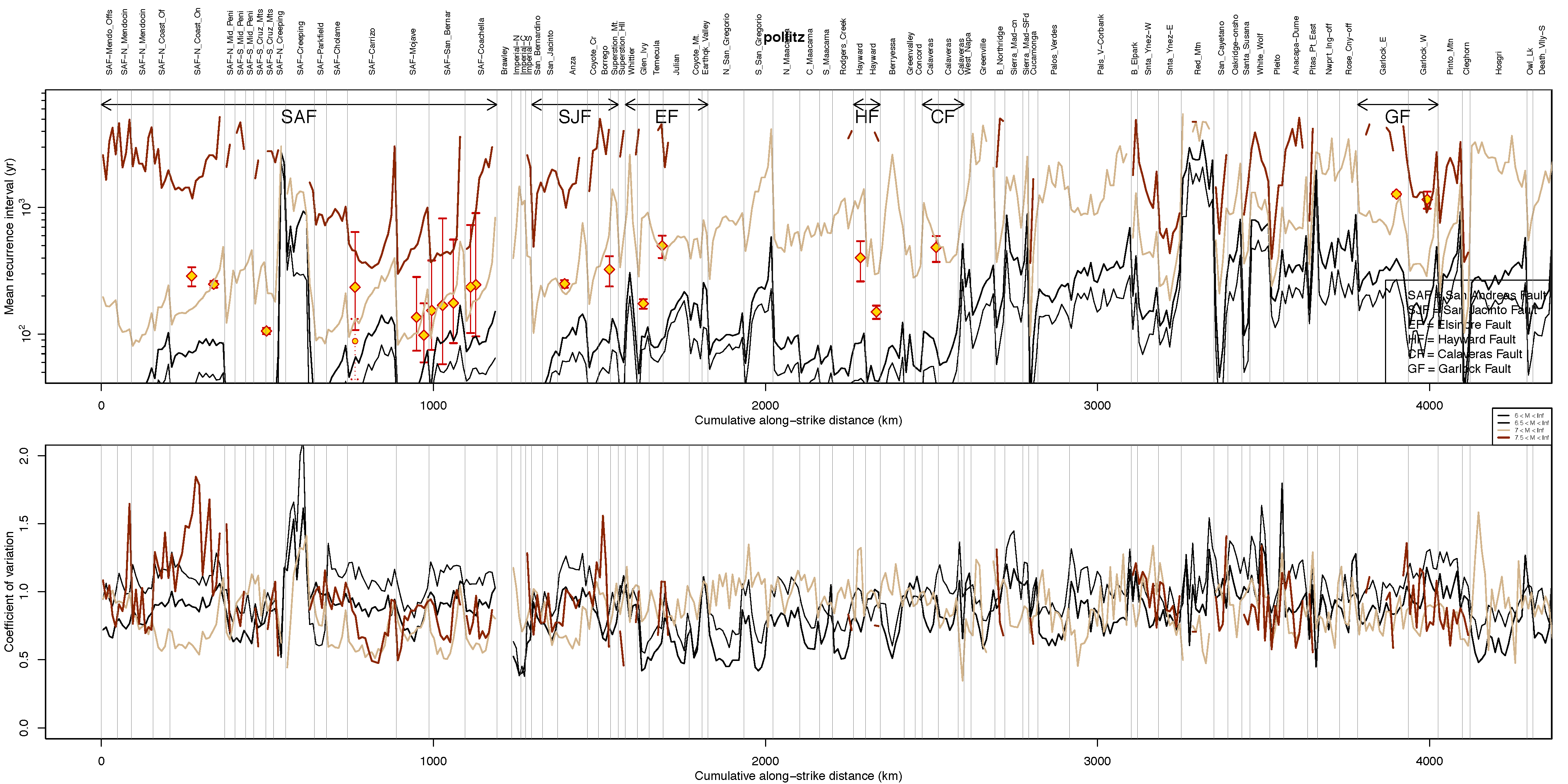
Figure S12. Same as Figure S 11, but for VIRTCAL simulator.
Figure S13. Same as Figure S 11, but for RSQSim simulator.
Figure S14. Same as Figure S 11, but for ViscoSim simulator.
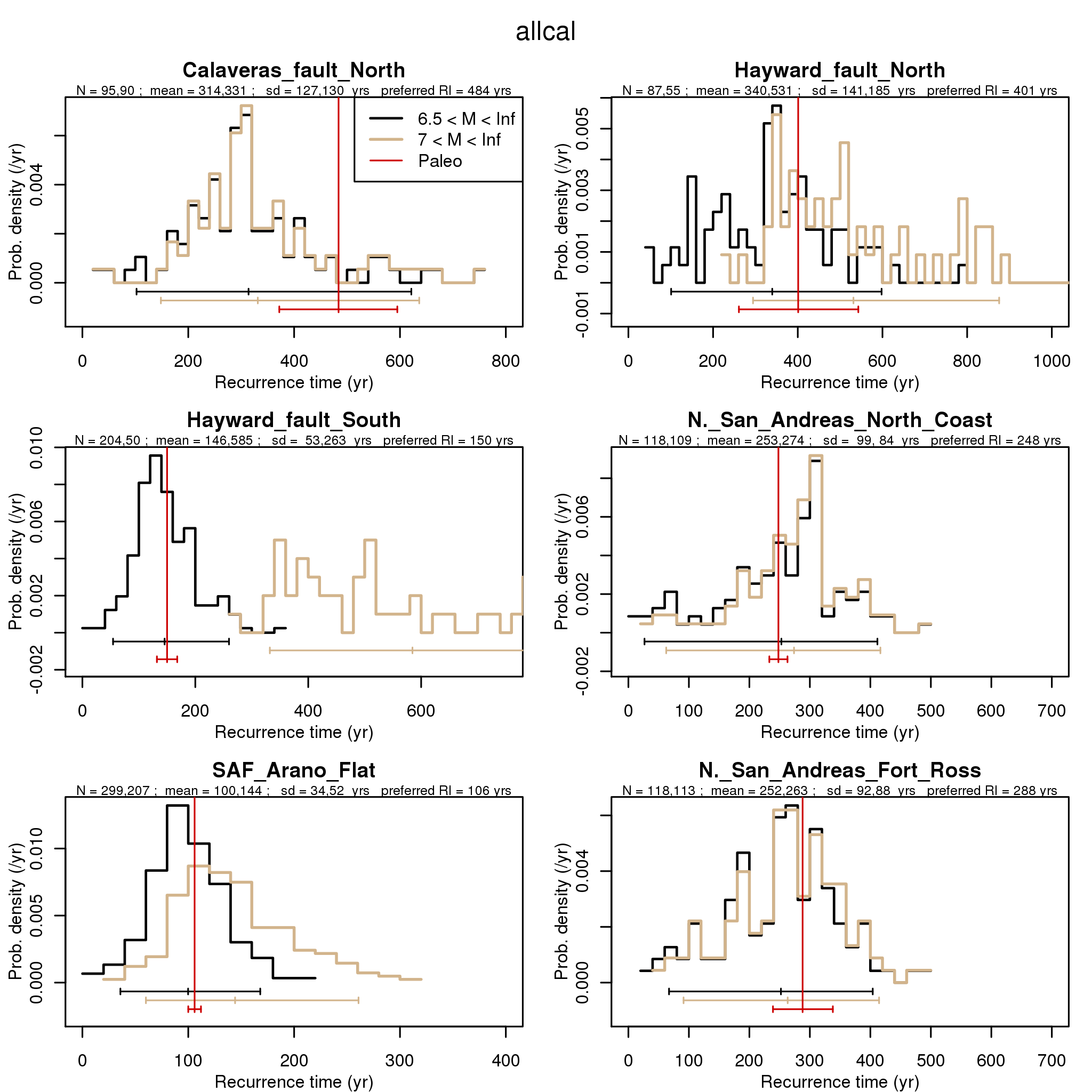
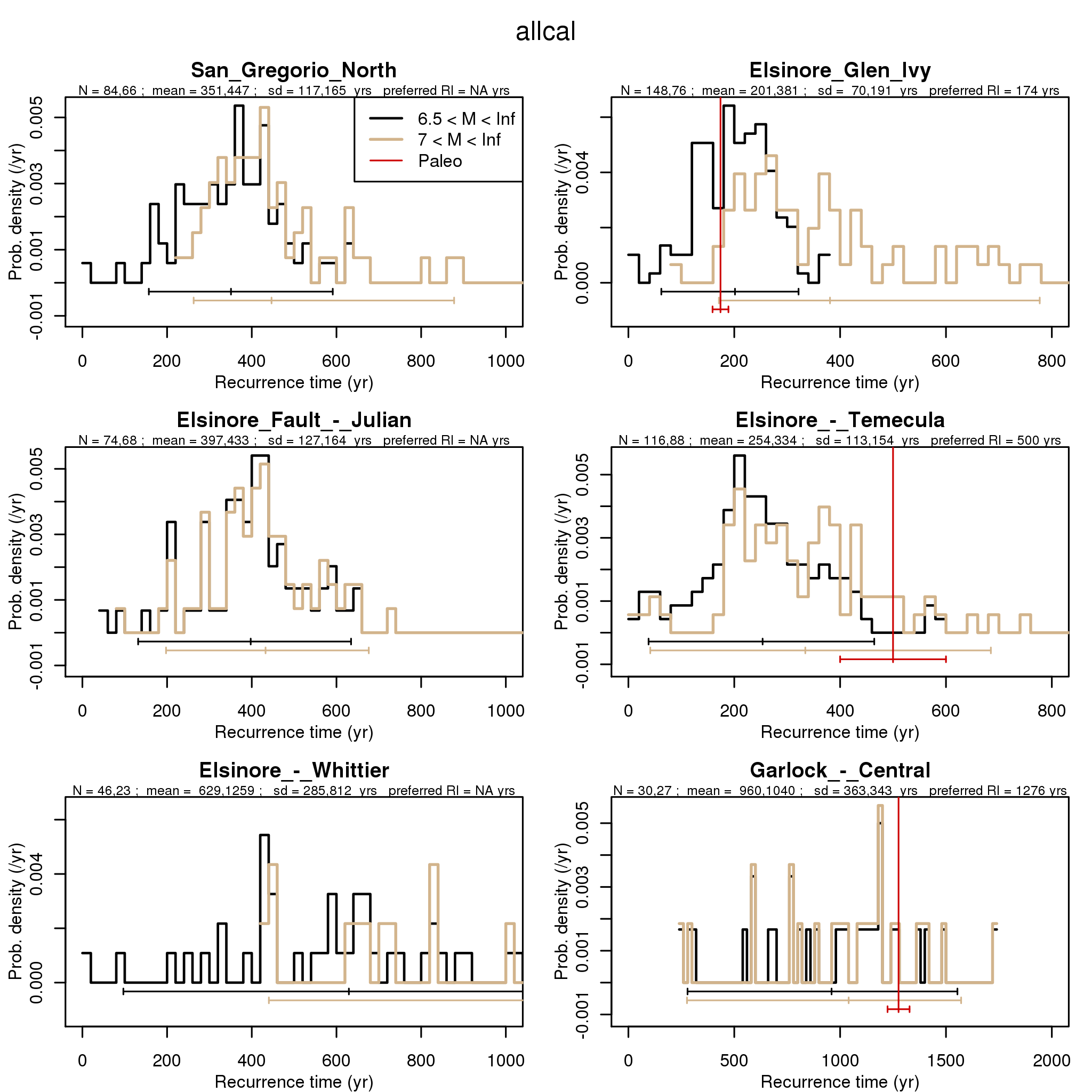
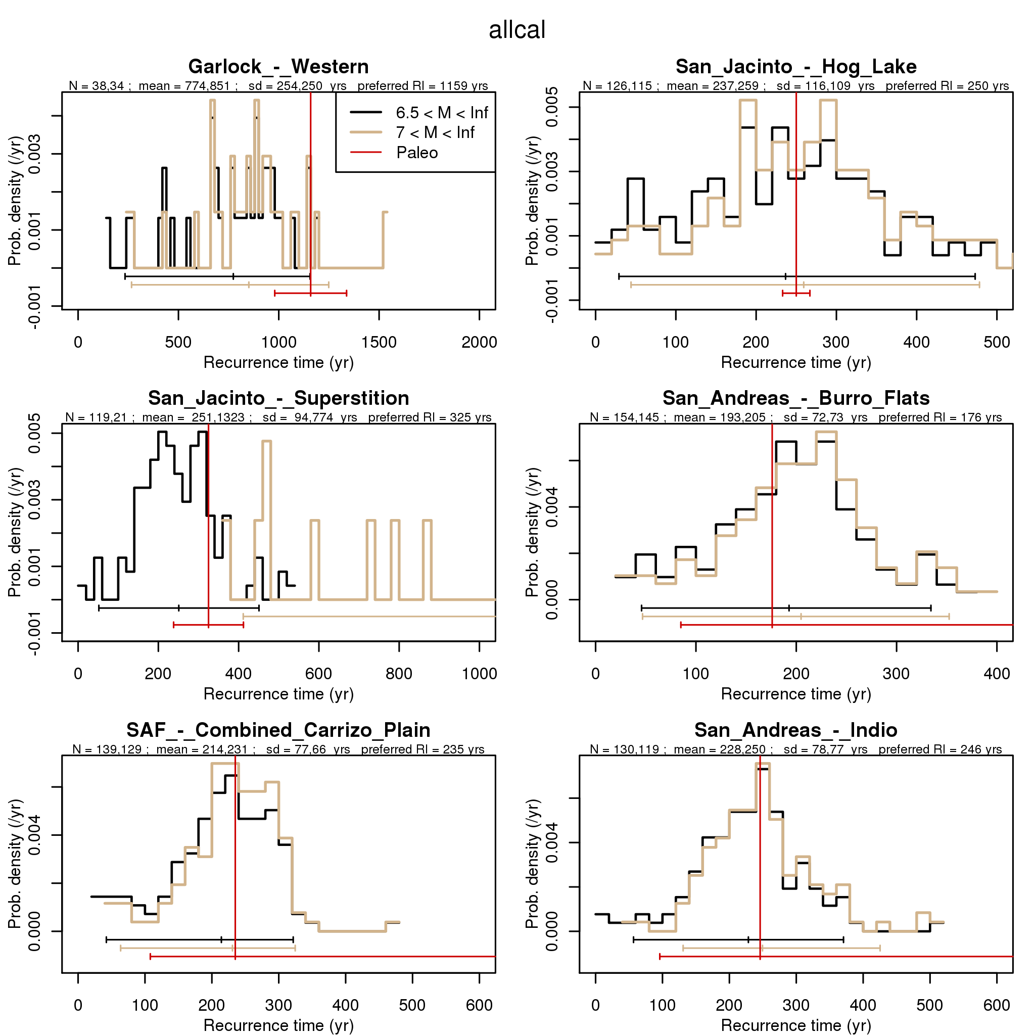
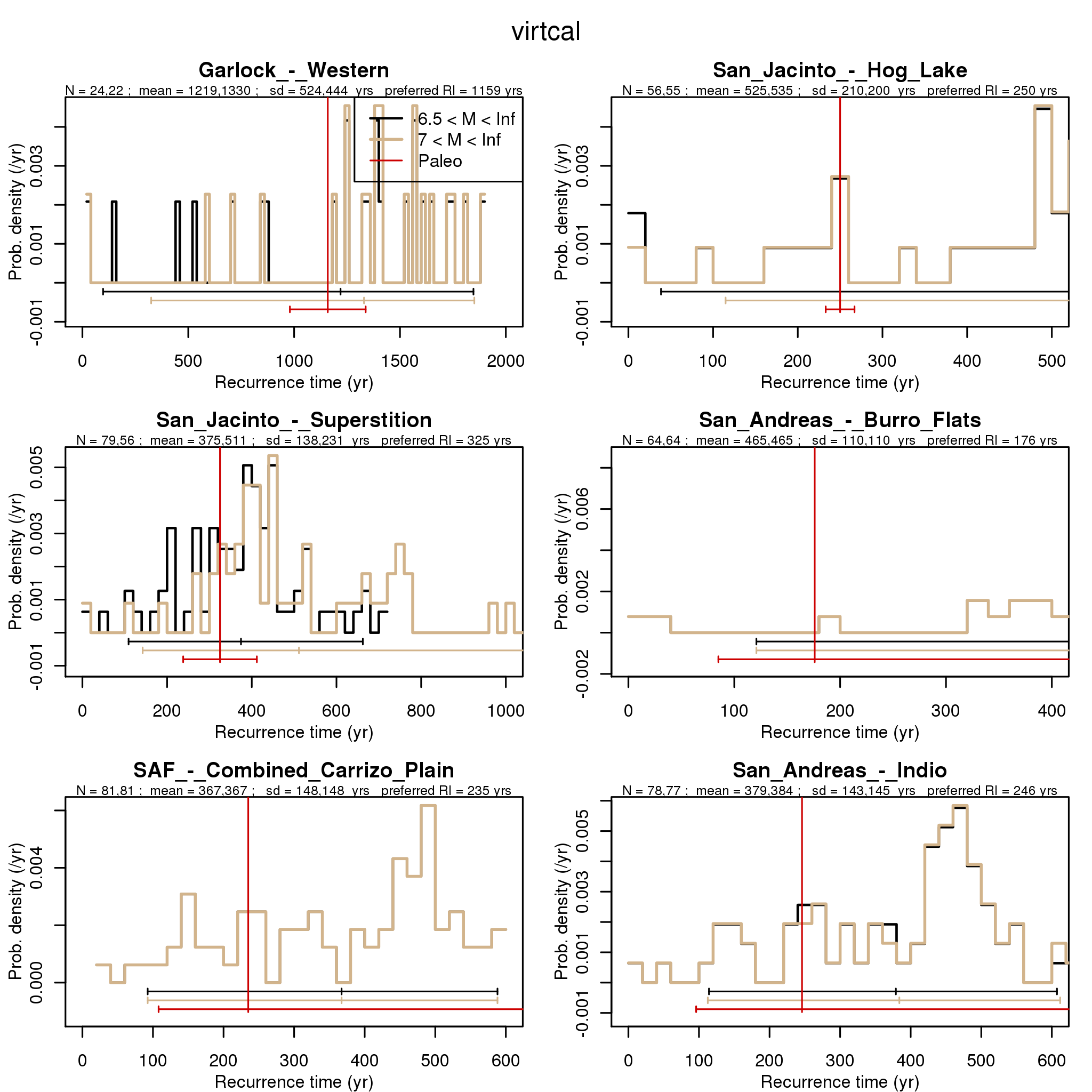
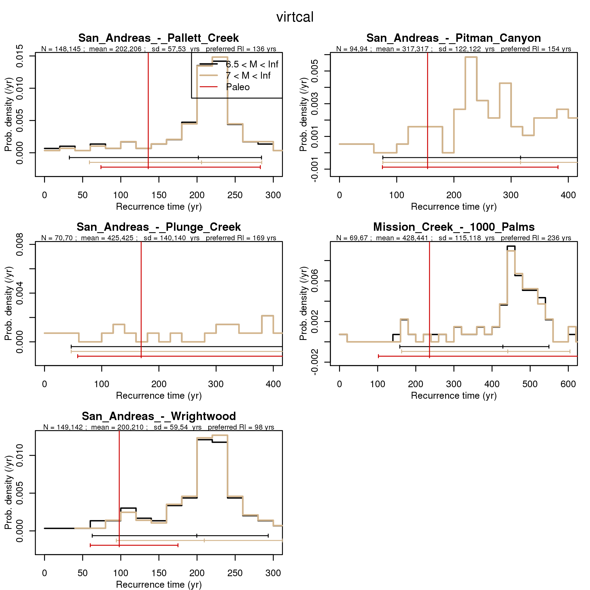
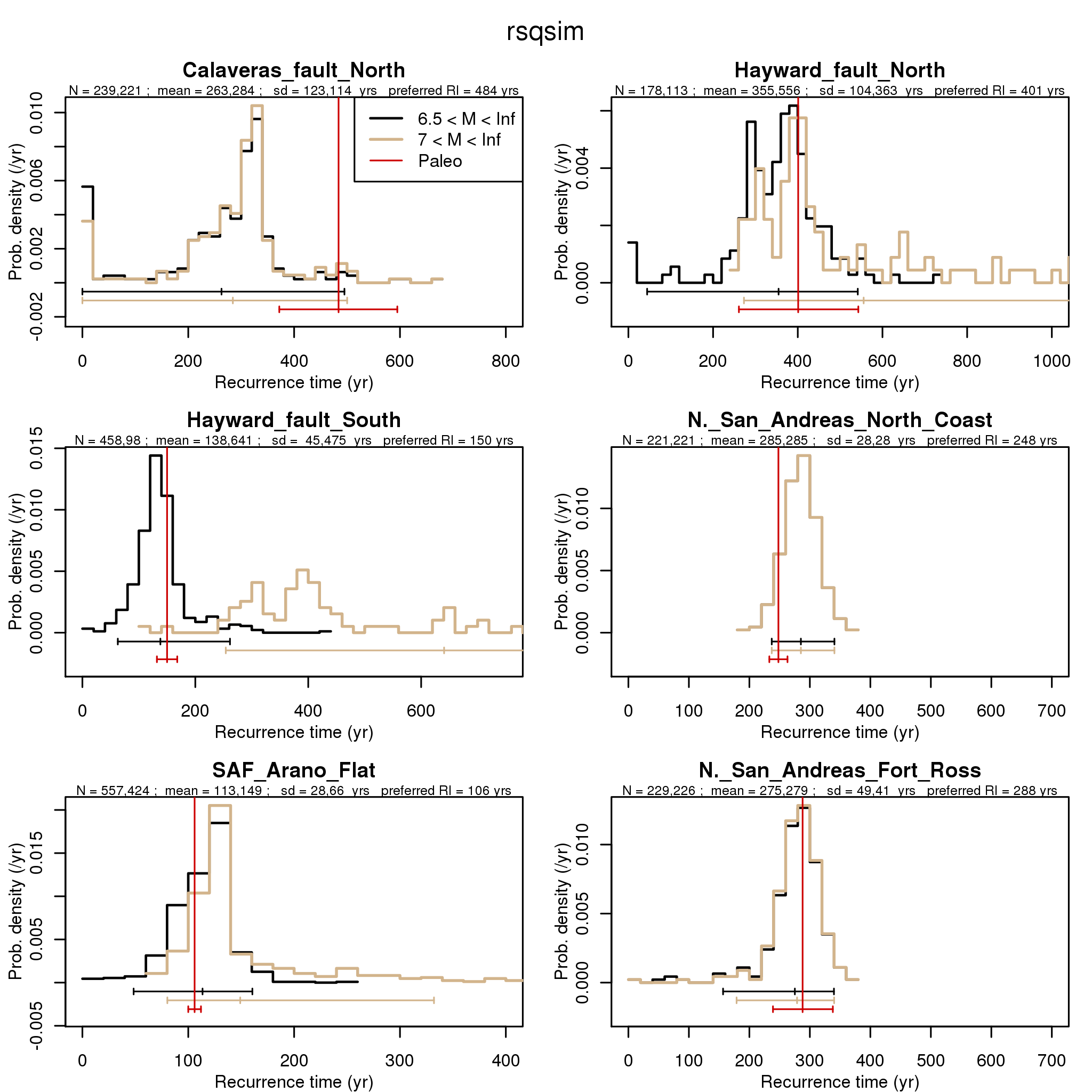
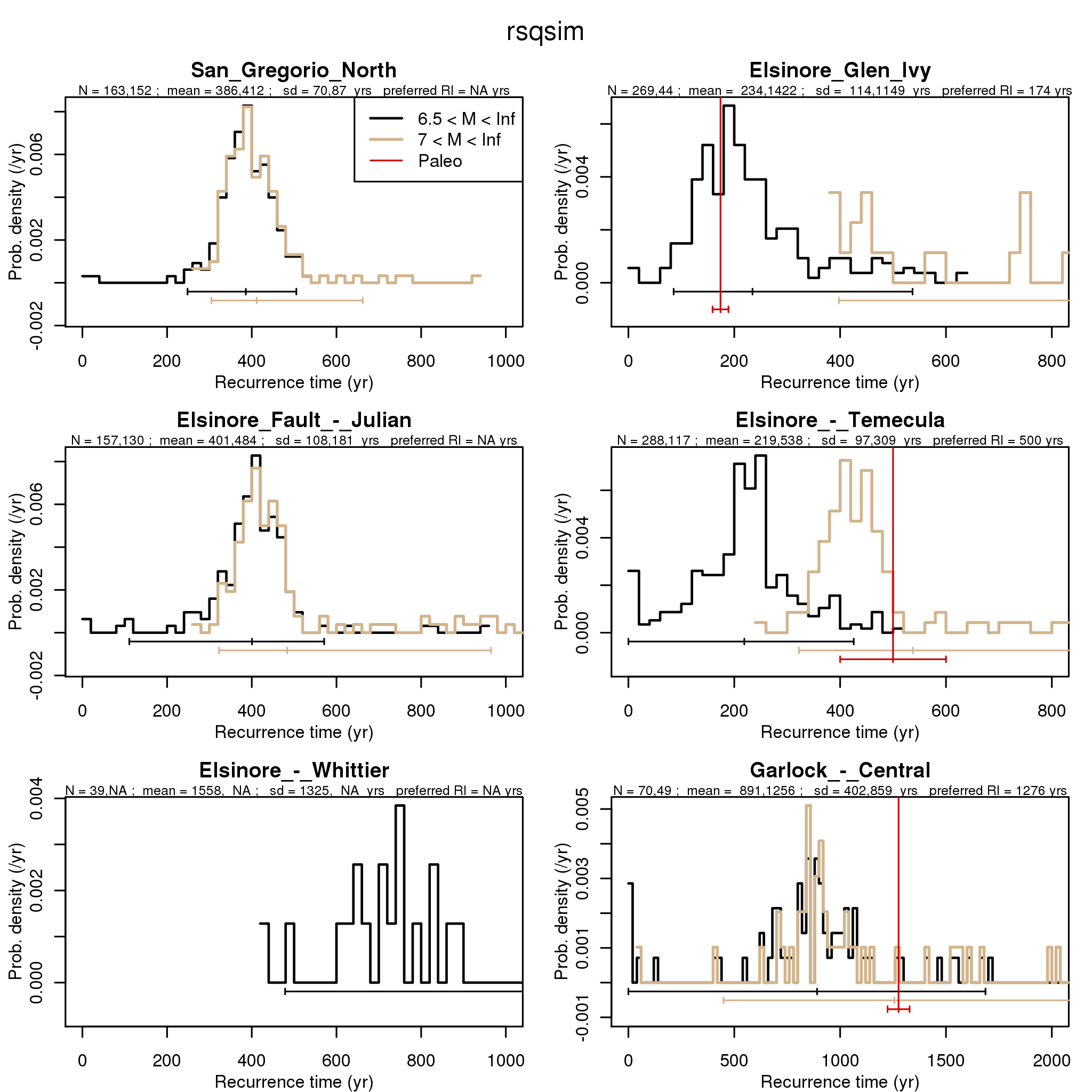
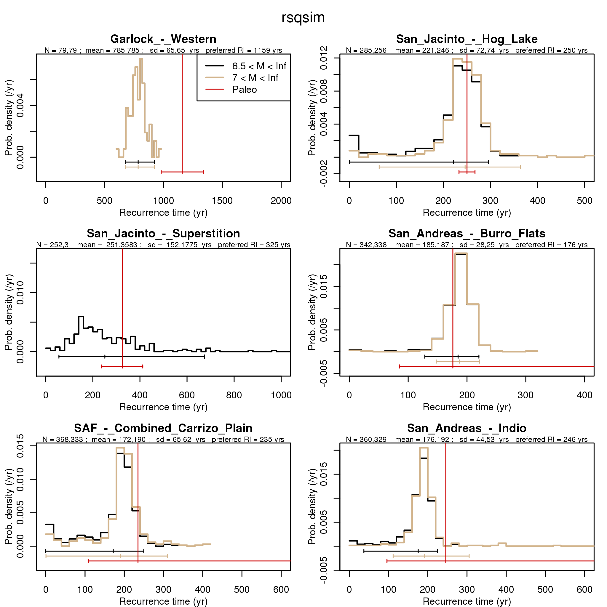
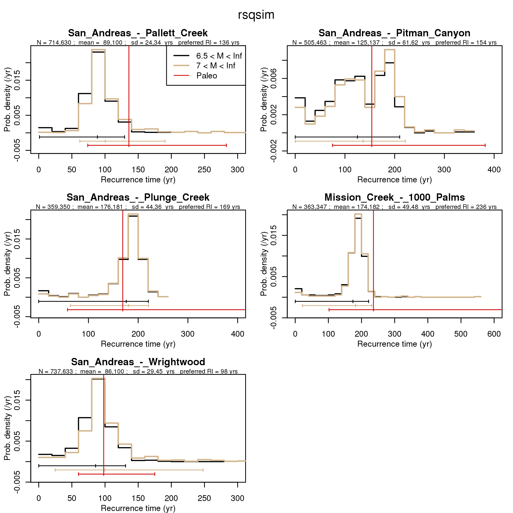
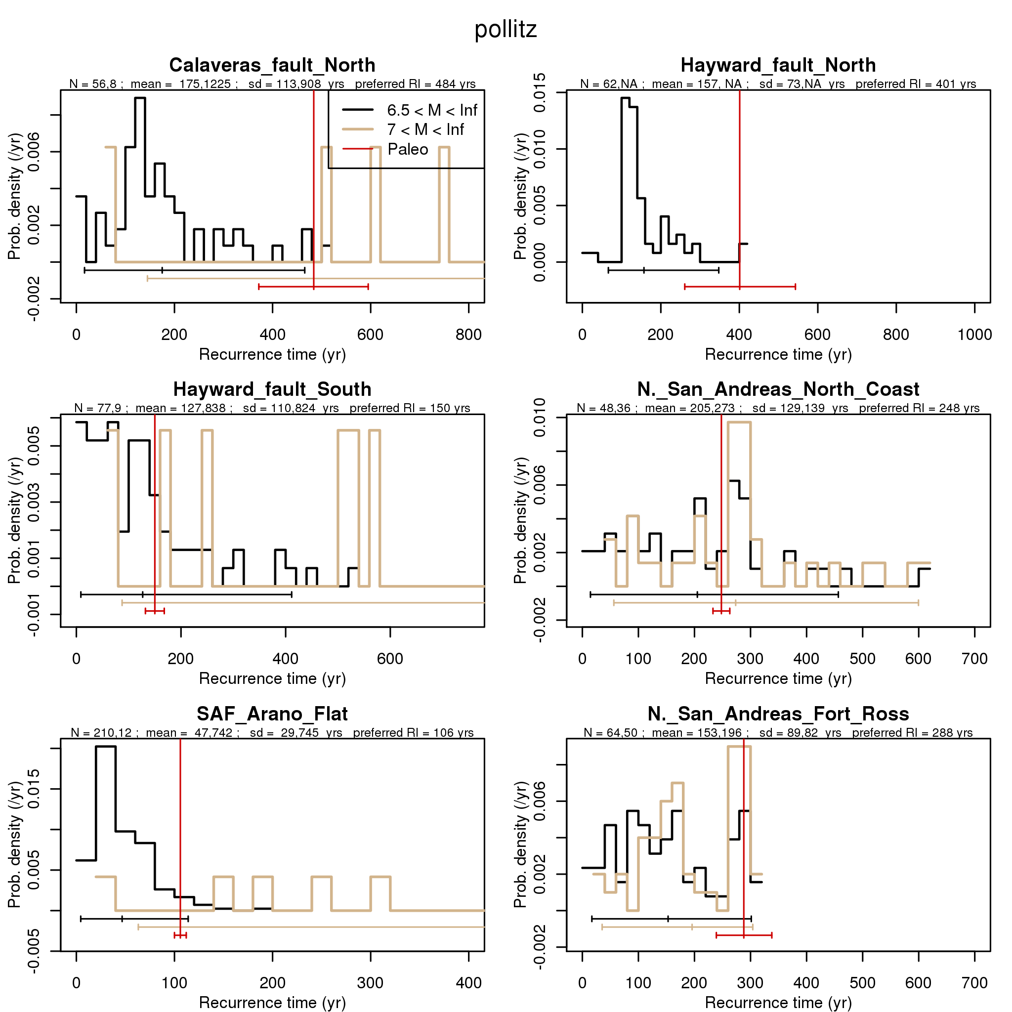
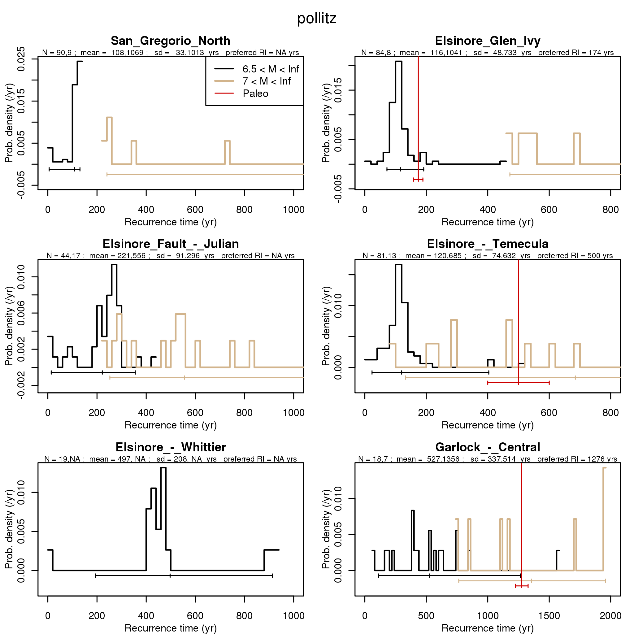
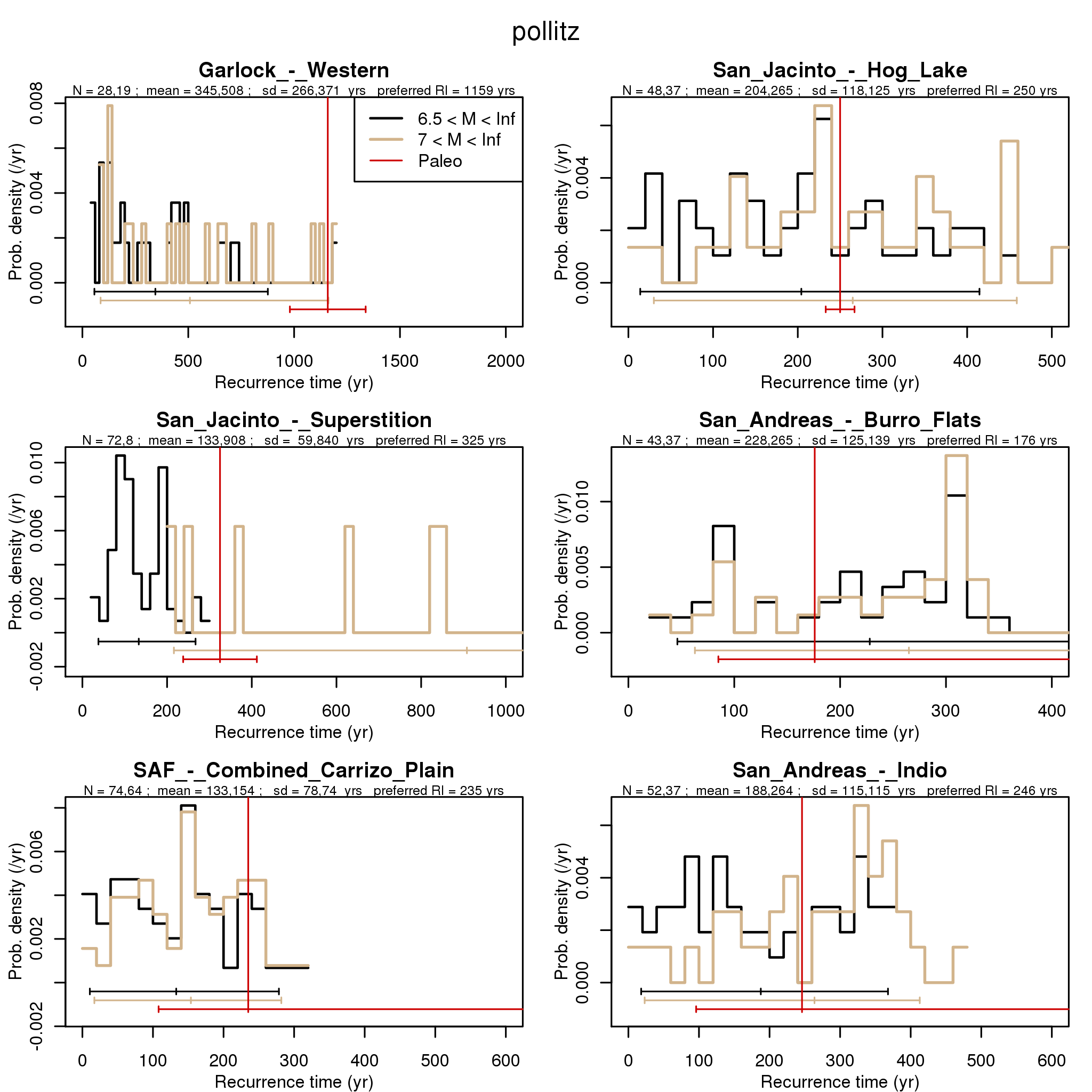
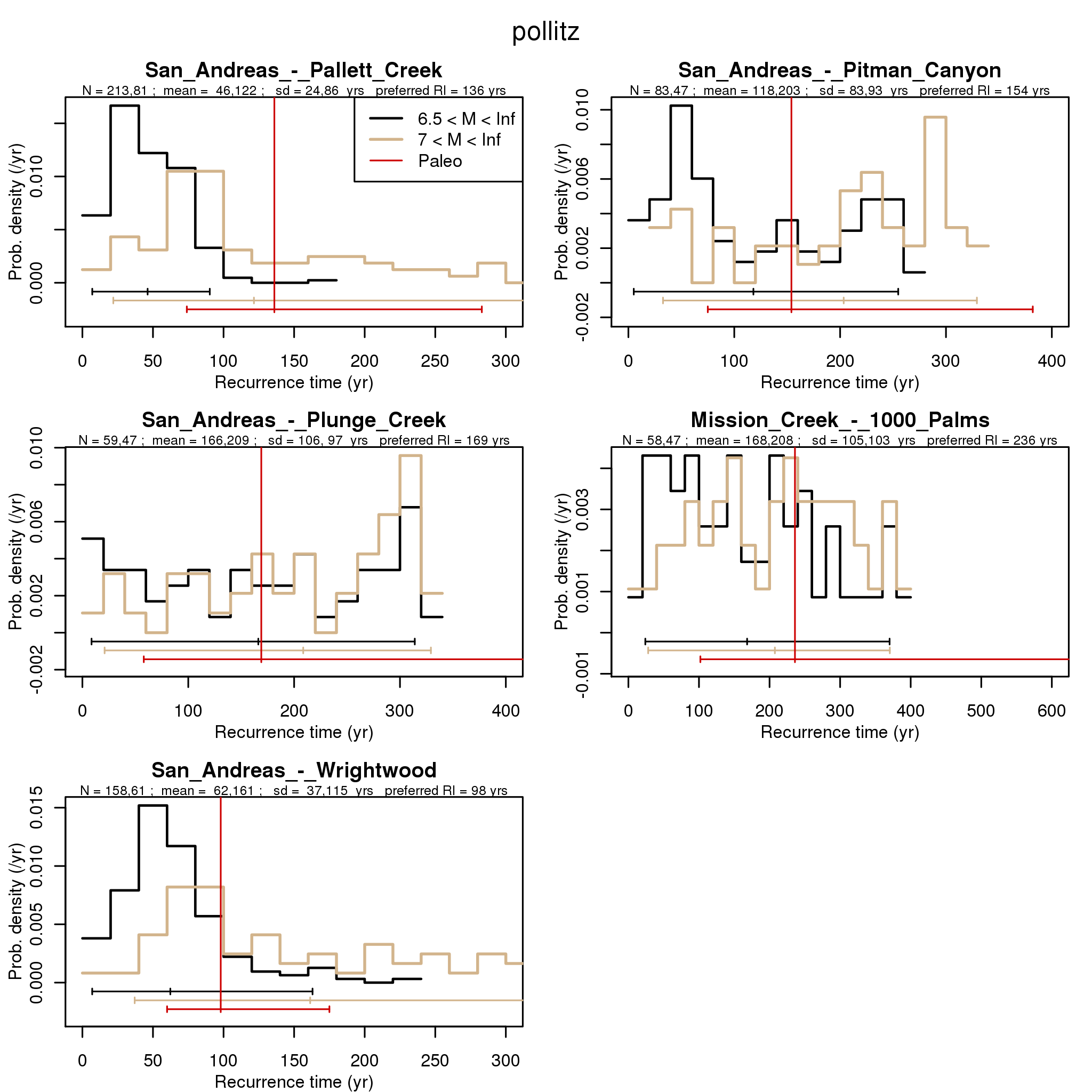
Figure S15. Probability distribution functions of recurrence intervals for M6.5+ (black) and M7+ (brown) events for 6 sites having paleoseismic data on recurrence interval for ALLCAL simulator. Also shown in red are inferred mean, min, and max recurrence values at these sites from the UCERF2 report, Appendix C, Table 5 [Field et al., 2008]. These only give some estimate of the observed range and are not comparable with the 95% confidence intervals shown for the simulations. The stress-drop values used have been adjusted so the simulated recurrence intervals approximately match the observed means for those fault sections with paleoseismic sites. However, questions exist about the size of events that would be identified at such sites. Similar plots for all the other sites with paleoseismic data and for all four simulators are shown in Figures S16-S30.
Figure S16. Same as Figure S15, but for 6 other sites.
Figure S17. Same as Figure S15 and 16, but for 6 other sites.
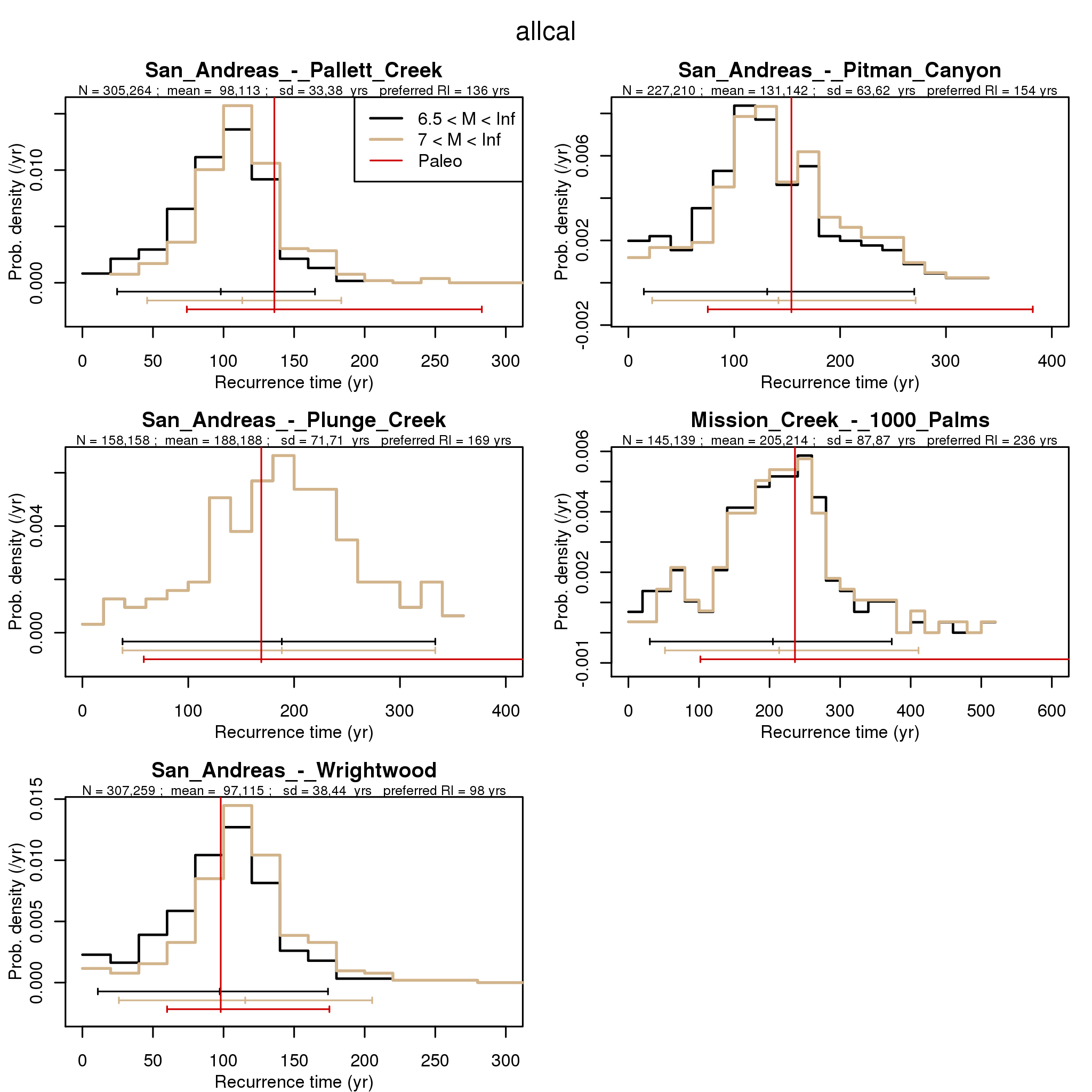
Figure S18. Same as Figure S15, S16, and S17, but for the 5 final sites with paleoseismic data.
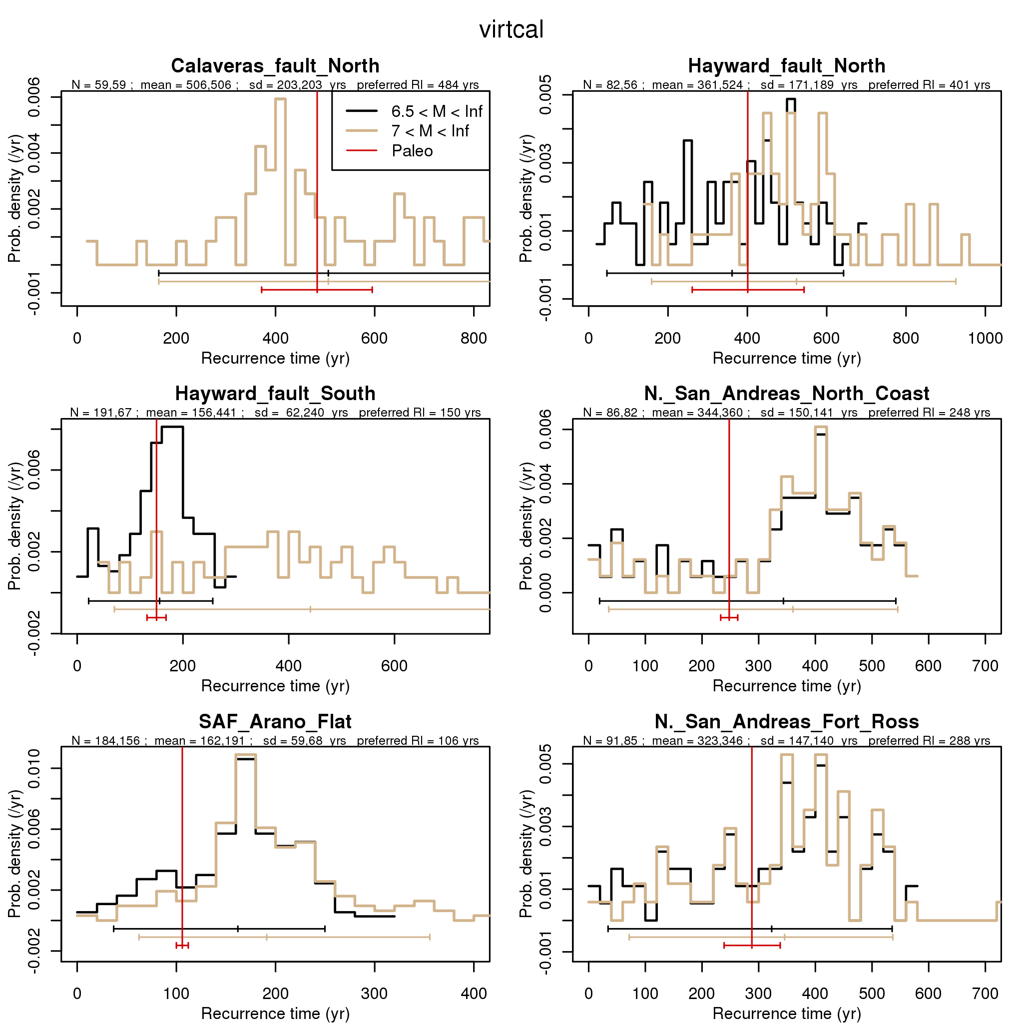
Figure S19. Same as Figure S15, but for VIRTCAL simulator.
Figure S20. Same as Figure S16, but for VIRTCAL simulator.
Figure S21. Same as Figure S17, but for VIRTCAL simulator.
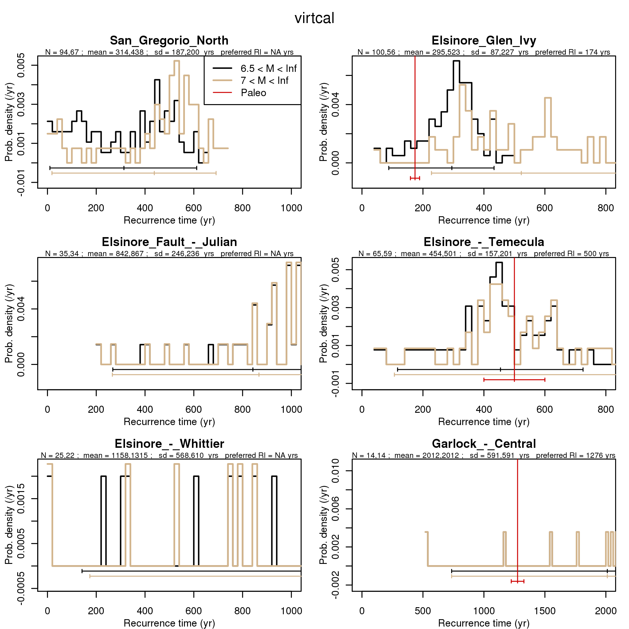
Figure S22. Same as Figure S18, but for VIRTCAL simulator.
Figure S23. Same as Figures S15 and S19, but for RSQSim simulator.
Figure S24. Same as Figures S16 and S20, but for RSQSim simulator.
Figure S25. Same as Figures S17 and S21, but for RSQSim simulator.
Figure S26. Same as Figures S18 and S22, but for RSQSim simulator.
Figure S27. Same as Figures S15, S19, and S23, but for ViscoSim simulator.
Figure S28. Same as Figures S16, S20, and S24, but for ViscoSim simulator.
Figure S29. Same as Figures S17, S21, and S25, but for ViscoSim simulator.
Figure S30. Same as Figures S18, S23, and S26, but for ViscoSim simulator.
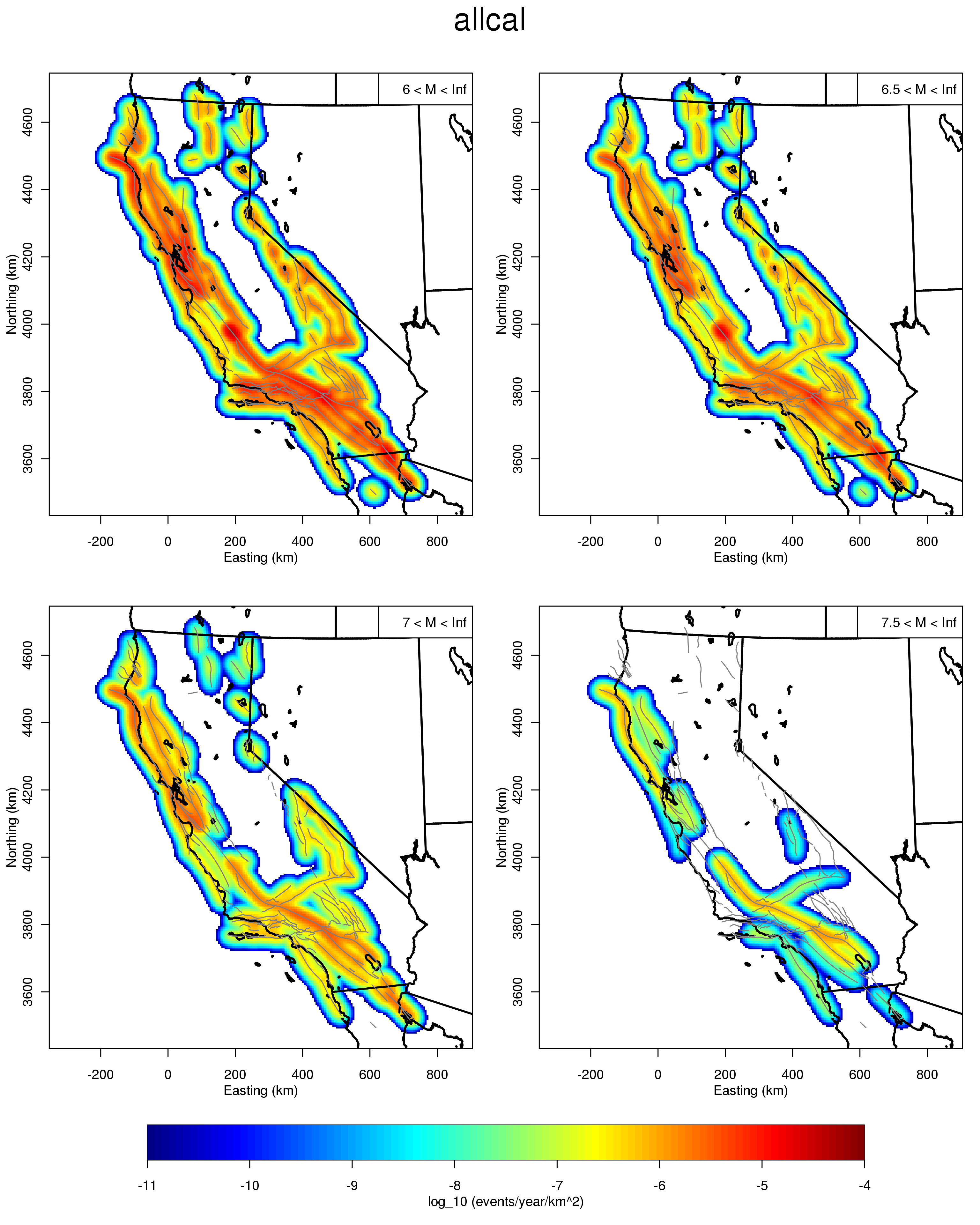
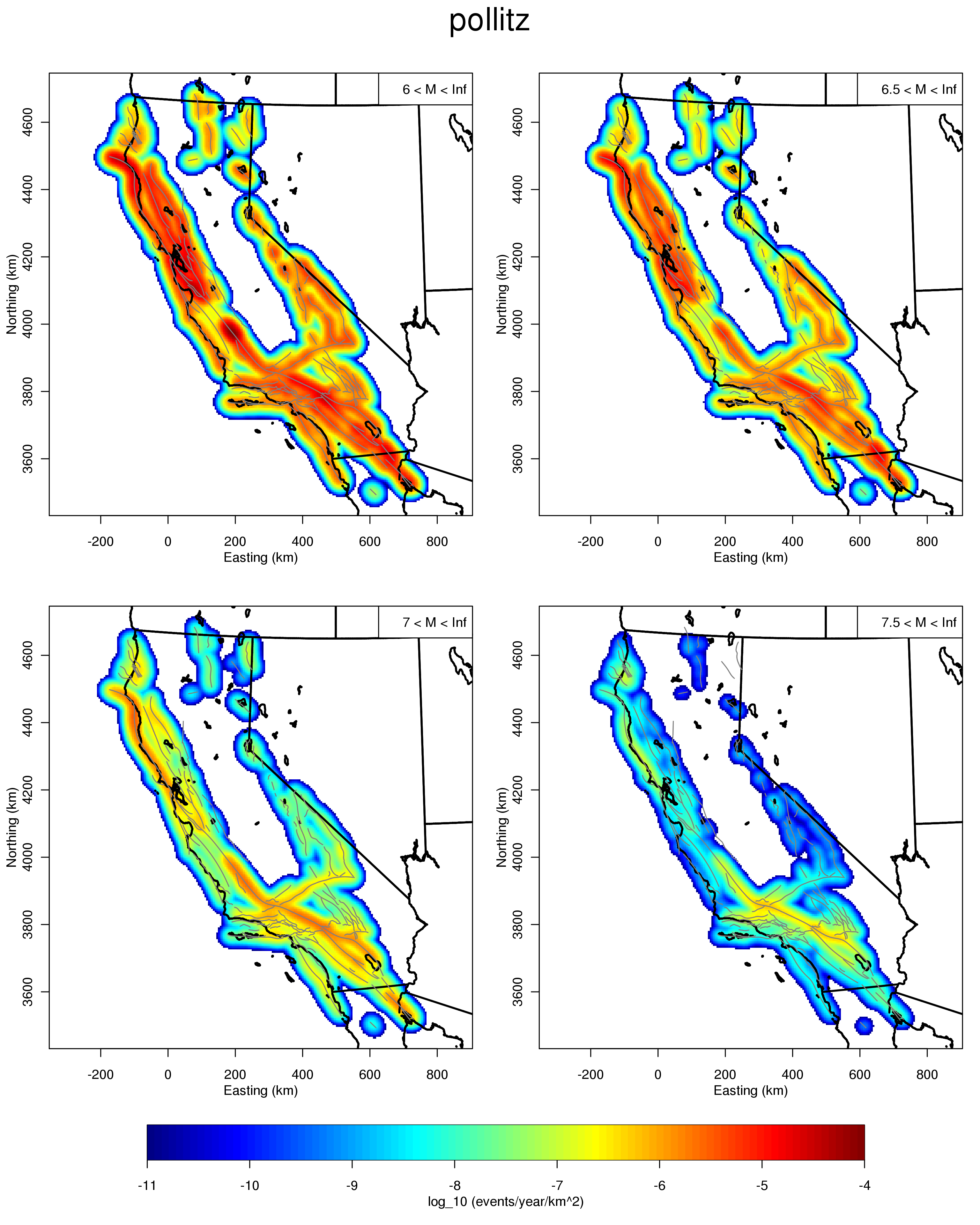
Figure S31. Earthquake density in events per year per square km for magnitudes greater than 6, 6.5, 7, and 7.5 from ALLCAL simulator, also shown as Figure 12 of the paper. Results for other simulators are shown as Figures S32-S34.
Figure S32. Same as Figure S31, but for VIRTCAL simulator.
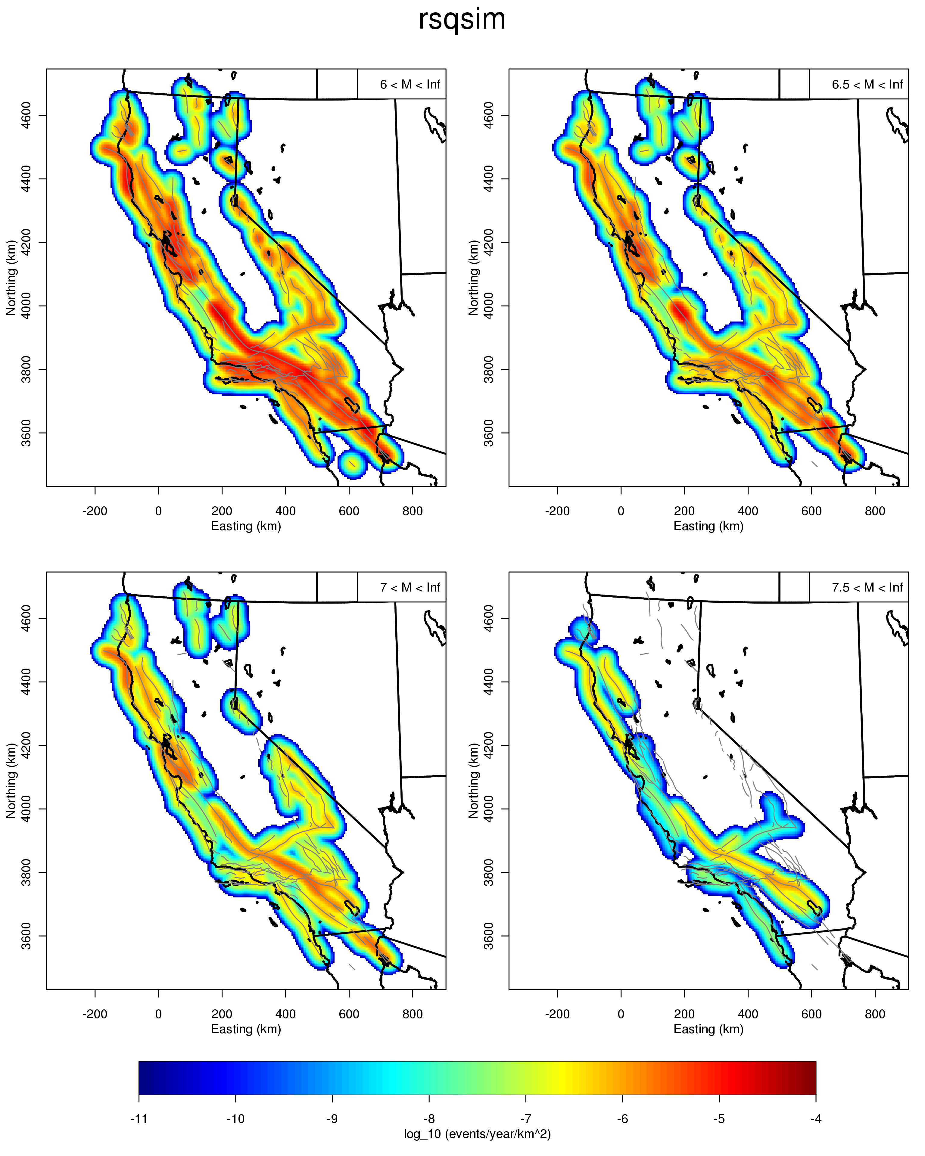
Figure S33. Same as Figure S31, but for RSQSim simulator.
Figure S34. Same as Figure S31, but for ViscoSIm simulator.
Ellsworth, W. L. (2003), Magnitude and area data for strike slip earthquakes, Appendix D, Earthquake Probabilities in the San Francisco Bay Region: 2002-2031, USGS Open-File Report 2003-214.
Field, E. H., et al. (2008), The Uniform California Earthquake Rupture Forecast, Version 2 (UCERF 2), USGS Open File Report 2007-1437.
Hanks, T. C., and W. H. Bakun (2002), A bilinear source-scaling model for M-log A observations of continental earthquakes, Bull. Seis. Soc. Am., 92(5), 1841-1846; DOI: 1810.1785/0120010148.
Wells, D. L., and K. J. Coppersmith (1994), New empirical relationships among magnitude, rupture length, rupture width, rupture area and surface displacement, Bull. Seis. Soc. Am., 84(4), 974-1002.
[ Back ]