
Upside-down Quakes: Displaying 3D Seismicity with Google Earth
Duncan Carr Agnew
University of California, San Diego
INTRODUCTION
Seismologists have long struggled with how to display their data effectively, since earthquakes, like other geological processes, occur in three spatial dimensions and time. Seismicity has additional dimensions: there is the obvious variable of earthquake size, which itself becomes multidimensional once we extend this to the tensor-valued quantity (the moment tensor) that is the simplest description of the earthquake source. Given the human ability to see patterns, visualization is a powerful tool for investigating earthquake behavior; although it can be perilous if the patterns seen are not statistically checked, it is better to have seen and abandoned a pattern than not to have seen it at all.
The most obvious problem in visualizing seismicity is that it occurs in three dimensions but must be displayed in two. The simplest solution is to show at least two views: usually a map with cross-sections, analogous to the plan and elevation drawings of architects and engineers (Ferguson 1992). Several authors (Johnson and Richter 1979; German and Johnson 1983, 193–198; Reasenberg and Ellsworth 1982; Wells 2002) have used pairs of stereoscopic drawings; when each is viewed with one eye, the fused drawing gives a convincing sense of depth thanks to the human system of binocular vision. For individuals, this requires either severe myopia or special viewers. For groups, special projection and viewing equipment is needed to restrict each image to a single eye, as for example in the GeoWall projection system (Johnson et al. 2006).
However, binocular vision is not the only way in which our visual systems estimate relative location in three dimensions; loss of one eye has little effect on this ability. Binocular parallax can only work over a finite range of distances and differences in depth. Other sources of location information include:
- Geometric perspective: the relation between distance and angular size for a given physical dimension. Since its systematization in Italy in the 1400s (Wright 1983; Edgerton 1992) this has been the standard tool in Western art for the depiction of three-dimensional space on a flat surface.
- Atmospheric or aerial perspective, an even older artistic tool, is the change in color and distinctness of distant objects caused by atmospheric scattering; Lynch and Mazuk (2005) discuss the physics of this.
- Optical flow (Longuet-Higgins and Prazdny 1980; Koenderink 1988): this is the motion of a scene across the retina as the viewer moves about. This flow can include motion parallax, in which more distant features move more slowly; occlusion, in which closer features hide those more distant; and spin parallax, in which the three-dimensionality of an object is indicated by changes in shape as it rotates, even if viewed from a fixed location. In the retinal field all these phenomena produce velocities and rates of deformation that the brain uses to infer relative position.
The first two of these are most useful in a setting with familiar objects; without knowing expected sizes, and in the absence of an atmosphere, it is much more difficult to judge distances, as was shown by the difficulties the lunar astronauts had in deciding where they, and nearby features, were (Wilhelms 1993). The work of many Surrealist artists shows that even in scenes of abstract forms (such as symbols representing earthquakes) these first two forms of perspective can still be helpful, but can be insufficient. However, the depth cues provided by motion are unimpaired in unfamiliar scenes, as evidenced by the convincing impression of reality provided by video of imaginary places, especially those that we can (apparently) move through. Unfortunately, such “virtual reality” systems are still not commonly available for use in scientific visualization: while there are many visualization tools, they are often costly, limited to particular computer systems, or difficult to learn; and few of them are designed for georeferenced data. An early exception was the program developed by Lees (2000), which uses spin parallax to show 3D displays. More recently, the commercial package Fledermaus (for which a free viewer is available) has been used to display a variety of geophysical datasets, including seismicity (Jacobs et al. 2008); this also relies on motion parallax.
I hope to show that one freely available display system, the Google Earth viewer, is well-suited to visualizing seismicity, something best illustrated by examples of how it can be used to display both spatial distributions and temporal changes.
DISPLAYING EARTHQUAKES IN GOOGLE EARTH
For those unfamiliar with the program, the Google Earth viewer is a system originally developed by Keyhole, Inc., which was founded in 2001 to provide geospatial visualization tools. Google purchased the company in 2004 and released a public version of the viewer in 2005 as part of the Google Earth service. For most users the most notable feature of this service is the speed and ease with which it provides high-quality imagery of the Earth’s surface. For viewing seismicity the imagery is less important than the fact that the viewer drapes the imagery over topography, and the resulting three-dimensional surface is displayed in ways that combine all the non-binocular depth cues to provide a convincing representation of depth. The Google Earth viewer also can easily import and display other data sets if these are described appropriately.
The appropriate description uses a markup language originally called Keyhole Markup Language and now known as OGR KML. This is a human-readable format that contains both data and instructions (“markup”) that tell the Google Earth viewer how to display the data. Data are geographically referenced: that is, positions are specified in longitude, latitude, and elevation. KML has been adopted as a standard by the Open Geospatial Consortium (see http://www.opengeospatial.org/standards/kml).
That earthquakes are subterranean might seem an obstacle to their display; but if we turn the earthquakes upside-down, depth inverts to elevation and all hypocenters become visible as what might be called “reflected hypocenters.” In practice it is not difficult to perform the reinversion mentally while looking at the display, either for reflected hypocenters with respect to one another or for reflected hypocenters with respect to the geography below. For large depths there will be some distortion as depth is mapped to height, but even for depths of 600 km the horizontal distance between events will be increased by only 20%.
A Sample Google Earth File
| TABLE 1 Sample KML File |
|---|
<?xml version="1.0" encoding="UTF-8"?>
|
The full KML specification (Wilson et al. 2007) is quite lengthy; Wernecke (2009) provides a good tutorial for using the language. The features most salient to seismicity display can be described relatively briefly. Table 1 shows them by example, in a file that would display one earthquake.
KML, like other markup languages that follow the rules of SGML (standardized general markup language), contains elements that are delimited by strings of the form <type> and </type>, where “type” is a character string that specifies the element type. Elements are often nested; thus, this file is a “document,” containing a “folder” that contains a “placemark” that in turn contains a “point.” The first part of the file gives its “name” and then uses “style” elements to describe symbols to be displayed at reflected hypocenter locations. The style element links a unique string (79A) to the location of the actual image file to be displayed, also providing a scale factor to be applied to the image when it is displayed, the styles of a label that will appear next to it, and a balloon that will be displayed when the user clicks on an icon.
The actual image files (which can be in most common raster image formats, including PNG and JPG) are contained in a separate directory. This directory and the KML file can be combined using the “zip” utility to put both into a single compressed file, which is called a KMZ archive. The Google Earth viewer can read such an archive and display the combined KML and image information. Being able to use different icons for different classes of points is part of what makes the Google Earth viewer so powerful for visualizing seismicity.
After the style definitions comes the main part of the file, in which each earthquake appears as a placemark element; particular sets of these can be contained within folder elements. The user can choose which folders to include in the display. The viewer renders each placemark by showing an icon, which is referenced through the “styleUrl” element; this element gives the URL of one of the IDs defined in a style element. (Here the URLs are local references, but they may point to icons available elsewhere on the Web). In this example, each placemark is a point element, whose location (the reflected hypocenter location) is given by coordinates of latitude, longitude, and elevation (instead of depth). Elevation can be given as above sea level or above the local ground level; the former, which to be precise is the elevation above the EGM96 geoid (Lemoine et al. 1998), is adequately accurate for most displays.
Each placemark has a name, which is rendered as a label next to its icon. A placemark that is represented as a point can have a “description” element associated with it; this element can contain additional material, which will be displayed in a balloon when the user clicks on the icon. The “BalloonStyle” element in each style shows what information will be displayed and how: in this case the name (larger and in bold) and the description. In the description element, the “CDATA” delimiter allows a subset of HTML to be used for formatting. In this example the “snippet” element, which can be used to give a short description, is set empty so that only the name is displayed.
This example also shows another (optional) element, relating to time. This “timestamp” element, containing a “when” time, specifies when the icon will appear, if the time slider bar in the viewer is used; I describe this more fully in the next section. Times are given in the format yyyy-mm-ddThh:mm:ssC, where the time-zone code C is set to Z to denote UTC; as this example shows, times may be given to lower precision by dropping parts of this string.
AN EDUCATIONAL EXAMPLE: AUGMENTED EVC CATALOG
The example just described was shortened from a KML file designed to show the long-term distribution of global seismicity.1Available at http://igppweb.ucsd.edu/~agnew/udq/udq.maj1900on.html. Much of the data in this file were taken from the catalog of Engdahl and Villaseñor (2002), who created the International Association of Seismology and Physics of the Earth’s Interior (IASPEI) Centennial Catalog, also called the Engdahl- Villaseñor Centennial (EVC) Catalog. This catalog combines results from older catalogs with relocations using the method of Engdahl, van der Hilst, and Buland (1998), which are much better than those in the International Seismological Summary (ISS). Engdahl and Villaseñor combined these locations with locations in the ISS, in Gutenberg and Richter (1954), in Abe (1981, 1984), and in Utsu (1979, 1982a, 1982b), and with magnitude estimates from a wide range of sources, to provide a global seismicity catalog complete above magnitude 7.5 from about 1910 on and above magnitude 6.5 from about 1950.
To keep the display relatively uncrowded, only earthquakes magnitude 6.5 and above are included; the locations and magnitudes for these are almost all taken from an updated version of the EVC catalog provided by A. Villaseñor (personal communication), with some corrections from Ambrayses and Melville (1982) and Frohlich (2006). Since much popular interest in earthquakes stems from their role as natural hazards, I augmented the catalog with information on fatalities from the Significant Earthquake Database at the National Geophysical Data Center (http://www.ngdc.noaa.gov/hazard/earthqk.shtml) along with earthquake names from the Catalog of Damaging Earthquakes compiled by Dr. T. Utsu (http://iisee.kenken.go.jp/utsu/index_eng.html). I used color to show numbers of fatalities, with an increasingly reddish tint for larger numbers, or a bluish tint if the fatalities were mostly from tsunami. The size of the icon scales with magnitude; though of course the apparent size on the screen depends on distance, the icon size easily shows relative magnitudes for earthquakes in the same region. A label next to each icon gives the magnitude and date; the balloon that appears when the user clicks on a particular icon provides, at a minimum, a complete set of hypocenter parameters and the Flinn-Engdahl geographic region (Young et al. 1995).
One valuable feature of the Google Earth viewer is that hyperlinks in the KML file are shown appropriately in the display; if the user clicks on them, a Web browser will be opened to display the link. This feature makes it easy to include, in each earthquake description, links to:
- The sources of information for the parameters given.
- Web pages on particular earthquakes, a particularly valuable set being those maintained and updated by the National Earthquake Information Center (NEIC) of the U.S. Geological Survey (http://neic.usgs.gov/neis/eq_depot/).
- Articles available online, whether popular accounts or scientific papers on the earthquake. I have focused on the latter because one goal of the display, for undergraduate use, would be to acquaint students with the existence and nature of the scientific literature in this field.
Links to journal articles are easy to provide in many cases, since many journals provide digital object identifiers (DOIs) for some (often all) of their online content. Clicking the link takes the viewer directly to the abstract of an article and potentially the article itself (if provided free or through subscription).
By arranging different magnitudes in different “folders” in the KML file, it is possible for the user to look only at big (or small) earthquakes. Since each earthquake has an associated timestamp element, the Google Earth viewer automatically displays a slider bar, which can be adjusted to display only the earthquakes within a particular time interval. It thus becomes easy to look, for example, at just the magnitude 7s in some location for the 1950s and then at the same magnitude group for the 1990s. Even better for classroom use, the slider bar can be set to move forward in time automatically, providing a movie of seismicity over (say) a five-year interval that gradually shifts from 1900–1904 to 2003–2007. Figure 1 shows a (slightly cropped) screen shot from the Google Earth display for this KML file.
Specialized tools are not needed to create a KML file; the file for the EVC catalog was generated by scripts written in a basic UNIX shell, with heavy use of the awk language. The icons were created with the ImageMagick program convert, which is freely available (http://www.imagemagick.org).

▲ Figure 1. Google Earth view when the EVC file is loaded, looking almost due north from an eye altitude of 1,771 km, along the Andean subduction zone. The 1960 Chilean earthquake, which produced a destructive tsunami, is prominent in the foreground and the deep earthquakes beneath Argentina to the right; the 1994 Bolivian deep earthquake is seen in the distance, colored pink because it caused a few fatalities. Note that the eye altitude, as given in the display, can be used in the creation of stereopairs from screen shots: if we move the display point perpendicular to the direction of view by 0.03 times this altitude, we will have a separation between views that is roughly consistent with the ratio of human interocular distance to eye height. [Click image to view larger version.]
AFTERSHOCK SEQUENCES AND TRANSLUCENT ICONS
Many digital image formats specify color using four channels: red, green, blue, and alpha, or RGBA. The last of these specifies how much the color specified by RGB is to be added to any others being specified for the same pixel; this amounts to giving the opacity of this image. More precisely, suppose we have a base pixel with α = αb = 1 and a color described by the RGB vector Cb , and we superimpose on it an overlay with αo and Co. Then the color of the combined pixel is (Porter and Duff 1984):
Cc = (1 − αo)Cb + αoCo .
Thus, if αo is one, the overlay is seen as opaque; if it is zero, the overlay becomes transparent. With alpha set to (say) 0.1, what is displayed is a blend of the two, but with the overlay appearing nearly transparent.
Icons of varying opacity are useful for displaying plots of aftershock sequences or any other sequence of mutually dependent events. These are difficult to plot because we would usually like to show both early and later shocks, since early shocks (for example, the mainshock) are presumably connected with later ones. But showing all events often leads to overcrowding. Combining transparent icons with the time-stamping allowed in a KML file offers a solution. What is needed is a series of icons of the same size, but with alpha varying to make them increasingly transparent. In the KML file, these different icons can each be associated with a placemark with the same location, but with different time spans. To set the time spans we use instead of the KML timestamp element shown in the sample the KML “timespan” element; this element contains the elements “begin” and “end,” each containing a time string.
We can thus, for example, give an earthquake a completely opaque icon for the first day, one that is 80% opaque for the next two, 60% opaque for the next four, and so on, finally vanishing after 31 days. If we then specify that the viewer show a one-day span of data and sweep this span along the interval, we will see the earthquake fade away (in steps), allowing us to see later events near it while continuing to provide a reference for where it occurred.
The appropriate time dependence for this fading is to some extent a matter of convenience. Setting
α = 1
1 + t/τ
where t is the elapsed time from the earthquake, and τ a magnitude- dependent time constant, approximates the t−1 dependence of aftershock rate, while approaching one for small t. Since stress changes from smaller events will be overridden more rapidly by later changes, it is appropriate to make τ proportional to magnitude M : τ = kM. If we choose 10 different levels of opacity,
αm = 0. 95 − 0. 1m
for m running from 0 through 9, then the timespans for a particular earthquake having a particular opacity run from [t0, t1] through [t9, t10], where t0 = 0 and
The total time of visibility for an earthquake of given magnitude is thus 19kM, since an earthquake is invisible when α is below 0.05; k can be set to make this time whatever is convenient.
One limitation of the Google Earth viewer is that the slider bar used to display time is not controllable by the user: the time shown automatically extends from the earliest “begin” to the latest “end” contained in the KML file. When looking at an extended earthquake sequence it is therefore difficult to look at time spans that are much smaller than the overall length of the sequence, something particularly frustrating when trying to view the first and most active times of an aftershock sequence. The solution is to create N folder elements, each one associated with a time span such that opening each folder will display roughly the same number of icons, both those from events within the time span and those from earlier ones that have not yet faded out. Opening all the folders then displays the complete sequence, while opening individual folders zooms to periods of particular activity. The temporal boundaries can also be set to coincide with particular events, such as the mainshock of an aftershock sequence. Figure 2 shows two views of the aftershock sequence for the 1994 Northridge earthquake, using hypocenters from Lin et al. (2007).
Creating these multiple folders does create more placemark elements than there are earthquakes, since any event whose icon should appear in more than one folder must be represented by more than one placemark; each placemark must have “begin” and “end” times that fall within those appropriate for a folder. If one folder at a time is open, only one icon is displayed for each earthquake. If multiple folders are open and the slider bar allows events from all of them to be displayed, any earthquake that appears in all of them may be displayed as multiple overlapping icons, and clicking on the icon to get details of the event will cause the viewer to split it into multiple icons for the different appearances. If the slider bar is set to cover only a small time span, and this viewing span is moved through the total time span, different icons will appear at different times in a way that gives the desired effect of an earthquake fading away with time.
Because of the computations needed to perform temporal subdivision, and the need to easily include options, simple scripting was not adequate to generate this type of KML file; instead, I have written software to do this, and to handle other options as well, making it easy to go from a catalog listing to a KML file.2Source code, with documentation and examples, is available at http://igppweb.ucsd.edu/~agnew/udq/udqpackage.html.
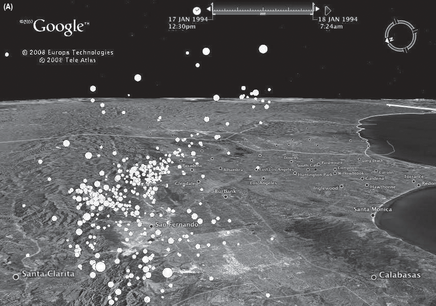
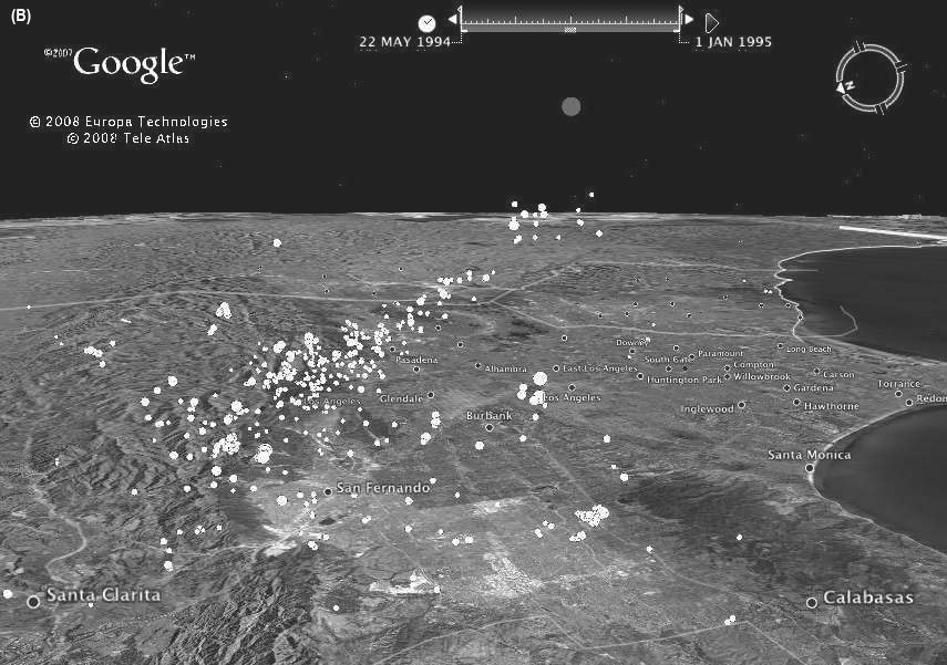
▲ Figure 2. Google Earth views when a file for the 1994 Northridge aftershock sequence is loaded. Both views look east and slightly down from a location west of the reflected mainshock hypocenter and 23 km high (2 km higher than the reflected depth of the mainshock). The top frame (A) shows the contents of a folder that starts at the time of the mainshock and ends 0.81 days after; the bottom (B), a folder from 125 days after to the end of 1995. Note the reflected mainshock hypocenter, rendered partly transparent, in the bottom view. [Click images to view larger versions.]
CONCLUSION
While many 3D visualization tools are available, most are not intrinsically georeferenced. Provided we are willing to accept the inversion of depth to height, the Google Earth viewer provides a tool that is georeferenced and includes not just realistic rendering and fly-through capabilities but also a built-in time display. The Google Earth viewer thus provides a full four-dimensional capability for looking at seismicity. The primary disadvantages of this viewer are the limitations on showing time variations, somewhat slow rendering for large data sets, and the need for a network connection to allow proper image display when zooming in or linking to other Web-based content.
The cost of this viewer is low: the basic version, which possesses all the capabilities needed, is free. Since the viewer is easy to install and useful for many educational and recreational purposes, it is far more commonly found than any other visualization system, making it attractive for educational use. ![]()
ACKNOWLEDGMENTS
I thank Bob Parker for the use of his script-handling routines, A. Villaseñor for an updated version of the EVC catalog, and Peter Shearer, Frank Wyatt, and an anonymous reviewer for comments. This work was partly supported by NSF EAR06- 42546.
REFERENCES
Abe, K. (1981). Magnitudes of large shallow earthquakes from 1904 to 1980. Physics of the Earth and Planetary Interiors 27, 72–92.
Abe, K. (1984). Complements to “Magnitudes of large shallow earthquakes from 1904 to 1980.” Physics of the Earth and Planetary Interiors 34, 17–23.
Ambrayses, N. N., and C. P. Melville (1982). A History of Persian Earthquakes. Cambridge: Cambridge University Press, 219 pps.
Edgerton, S. Y. (1992). The Heritage of Giotto’s Geometry: Art and Science on the Eve of the Scientific Revolution. Ithaca, NY: Cornell University Press.
Engdahl, E. R., R. D. Van der Hilst, and R. P. Buland (1998). Global teleseismic earthquake relocation with improved travel times and procedures for depth determination. Bulletin of the Seismological Society of America 88, 722–743.
Engdahl, E. R., and A. Villaseñor (2002). Global seismicity: 1900– 1999. In International Handbook of Earthquake and Engineering Seismology, Part A, ed. W. H. K. Lee, H. Kanamori, P. C. Jennings, and C. Kisslinger, 665–690. Boston: Academic Press.
Ferguson, Eugene S. (1992). Engineering and the Mind’s Eye. Cambridge, MA: MIT Press.
Frohlich, C. (2006). Deep Earthquakes. Cambridge: Cambridge University Press.
German, P., and C. Johnson (1983). Stereo: A Computer Program for Projecting and Plotting Stereograms. USGS Open-File Report 82-726.
Gutenberg, B., and C. F. Richter (1954). Seismicity of the Earth and Associated Phenomena. 2nd ed. Princeton, NJ: Princeton University Press.
Jacobs, A. M., D. Kilb, and G. Kent. (2008). 3-D interdisciplinary visualization: Tools for scientific analysis and communication. Seismological Research Letters 79, 867–876.
Johnson, A., J. Leigh, P. Morin, and P. Van Keken (2006). GeoWall: Stereoscopic visualization for geoscience research and education. IEEE Computer Graphics and Applications 26, 10–14.
Johnson, C. E., and F. M. Richter (1979). Stereoviews of seismicity associated with subduction zones. Journal of Geology 8, 467–474.
Koenderink, J. J. (1988). Optic flow. Vision Research 26, 161–180.
Lees, J. M. (2000). Geotouch: Software for three and four dimensional GIS in the earth sciences. Computers & Geosciences 26, 751–761.
Lemoine, F. G., S. C. Kenyon, J. K. Factor, R. G. Trimmer, N. K. Pavlis, D. S. Chinn, C. M. Cox, S. M. Klosko, S. B. Luthcke, M. H. Torrence, Y. M. Wang, R. G. Williamson, E. C. Pavlis, R. H. Rapp, and T. R. Olson (1998). The Development of the Joint NASA GSFC and NIMA Geopotential Model EGM96. NASA TP-1998-206861, NASA Goddard Space Flight Center.
Lin, G., P. M. Shearer, and E. Hauksson (2007). Applying a threedimensional velocity model, waveform cross correlation, and cluster analysis to locate southern California seismicity from 1981 to 2005. Journal of Geophysical Research 112, B12309; doi:10.1029/2007JB004986.
Longuet-Higgins, H. C., and K. Prazdny (1980). The interpretation of a moving retinal image. Proceedings of the Royal Society of London, Series B, Biological Sciences 208, 385–397.
Lynch, D. K., and S. Mazuk (2005). On the colors of distant objects. Applied Optics 44, 5,737–5,745.
Porter, T., and T. Duff (1984). Compositing digital images. ACM SIGGRAPH Computer Graphics 18, 253–259.
Reasenberg, P., and W. L. Ellsworth (1982). Aftershocks of the Coyote Lake, California earthquake of August 6, 1979: A detailed study. Journal of Geophysical Research. 87, 10,637–10,655.
Utsu, T. (1979). Seismicity of Japan from 1885 through 1925: A new catalog of earthquakes with M > 6, and smaller earthquakes which caused damage in Japan (in Japanese with English abstract). Bulletin of the Earthquake Research Institute 54, 253–308.
Utsu, T. (1982a). Seismicity of Japan from 1885 through 1925: Correction and supplement (in Japanese with English abstract). Bulletin of the Earthquake Research Institute 57, 111–117.
Utsu, T. (1982b). Catalog of large earthquakes in the region of Japan from 1885 through 1980 (in Japanese with English abstract). Bulletin of the Earthquake Research Institute 57, 401–463.
Wells, N. A. (2002). Display of Munsell color values, earthquakes, and other three- and four-parameter datasets in stereo 3D. Computers & Geosciences 28, 701–709.
Wernecke, J. (2009). The KML Handbook: Geographic Visualization for the Web. Upper Saddle River, NJ: Addison-Wesley.
Wilhelms, D. E. (1993). To a Rocky Moon: A Geologist’s History of Lunar Exploration. Tucson: University of Arizona Press.
Wilson, T., D. Burggraf, R. Lake, S. Patch, B. McClendon, M. Jones, M. Ashbridge, B. Hagemark, J. Wernecke, and C. Reed (2007). KML 2.2—An OGC Best Practice. Open Geospatial Consortium, Document OGC 07-113r1, http://portal.opengeospatial.org/files/?artifact_id=23689.
Wright, L. (1983). Perspective in Perspective. Boston: Routledge & Kegan Paul.
Young, J. B., B. W. Presgrave, H. Aichele, D. A. Wiens, and E. A. Flinn (1995). The Flinn-Engdahl regionalisation scheme: The 1995 revision. Physics of the Earth and Planetary Interiors 96, 221–300.
Footnotes
1 Available at http://igppweb.ucsd.edu/~agnew/udq/udq.maj1900on.html.
2 Source code, with documentation and examples, is available at http://igppweb.ucsd.edu/~agnew/udq/udqpackage.html.
[ Back ]
Posted: 24 April 2009