
3-D Interdisciplinary Visualization: Tools for Scientific Analysis and Communication
A. M. Jacobs,1 D. Kilb, and G. Kent
University of California, San Diego
INTRODUCTION
Within the scientific community, interdisciplinary analyses are increasingly emphasized to gain a more complete understanding of how entire Earth systems function. For National Science Foundation (NSF)-sponsored programs such as EarthScope (http://www.earthscope.org), Ridge 2000 (http://www.ridge2000.org), Margins (http://www.nsf-margins.org), and the Ocean Observatories Initiative (http://www.oceanleadership.org/ocean_observing), this includes trying to identify potentially complex linkages that exist between geological, biological, chemical, and/or physical processes occurring at predefined regions. For this interdisciplinary approach to succeed, numerous, and often disparate, datasets must be combined in a manner comprehensible and accessible to a wide range of scientists. To overcome this hurdle, NSF programs such as those listed above, as well as scientific journals and individual scientists, are turning to interactive, three-dimensional computer visualization as a primary tool for examining and communicating the results of scientific studies (e.g., Kent et al. 2000; Dzwinel et al. 2005; Nayak et al. 2005; Singh et al. 2006). This new ability to explore and interact with one-, two-, and three-dimensional geo-referenced datasets greatly enhances audiences’ understanding of the research environment as well as how the Earth functions as an interconnected system.
While visualization, by definition, is not new to the scientific community (e.g., maps, graphs, and drawings) (Koua et al. 2006), the ability to combine two- and three-dimensional data into a 3-D, interactive environment is a relatively recent and rapidly expanding technological and analytical advancement in the geosciences (Schwehr et al. 2005; Kilb and Nayak 2006). The increasing computer storage and processing resources, combined with software programs that are based on a modular methodology (where each dataset is treated as a building block that can be combined with other blocks to create a unified and exploratory environment), are making 3-D visualization more attractive to scientists.
For multidisciplinary, multidimensional research, 3-D visualization has certain key advantages over the standard 2-D (i.e., “on a sheet of paper”) presentation methods. First, when data are displayed in two dimensions, at least one primary parameter is usually lost because the plot or histogram is limited to at most the values of x, y, and a point. However, when using a 3-D visualization to display data, many parameters can be both plotted and explored simultaneously. Second, the modular software provides the ability to combine a mixture of one-, two-, and three-dimensional datasets, thus allowing for the generation of 3-D visual environments as basic or as advanced as necessary for a given audience.
As with any technological advance, trade-offs exist between maintaining the status quo and undertaking the learning curve required to gain the proficiency necessary to benefit from the evolving technology. We are not advocating that the use of 3-D visualization is essential to scientific studies, but instead highlighting the importance of scientists having a wide variety of tools at their disposal. For example, just as anomalous data points can sometimes be found more easily by scanning data in table form rather than examining the plotted points, poor alignments of crossing datasets can become more apparent when viewed in 3-D rather than in 2-D.
Using four specific case studies from given geographical locations, we discuss how 3-D visualizations generated with Interactive Visualization Systems (IVS) Fledermaus software are incorporated into our scientific research, and we present the advantages (and some challenges) of this visualization technology. These examples highlight how scientists can merge “presentation- ready” (e.g., already processed) 2- and 3-D datasets into single visualizations and then use them for interdisciplinary analyses and/or communicating the results to those unfamiliar with the data and research.
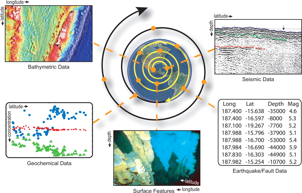
▲ Figure 1. Examples of the broad range of datasets that can be visually integrated when exploring a specific geographic location from different disciplines. Each orange circle on the spiral represents a geo-referenced dataset, or module. While visualization starts off with a single module, its expansion can benefit an entire scientific community as more modules are added. Visualizations provide the viewer with a better understanding of the study area and of unfamiliar data types, help identify potential linkages between datasets, and act as a tool for communicating science within a community and other interested parties.
THE MODULAR INTERACTIVE VISUALIZATION TECHNIQUE
The interdisciplinary approach to research often equates to multiple scientists working in the same general geographic location on data types ranging from microbiological fauna to petrogenic core samples to geophysical mantle dynamics. The disparity in size, resolution, and scale of such data present a challenge when trying to integrate all these data types (Figure 1). We find that using computer software based on a modular methodology best fits the need to bring this range of data together. For example, in IVS’s Fledermaus, datasets of various types can be transformed into a visual object and then combined with other visual objects through geo-referencing to create a 3-D visualization, or scene. A benefit of constructing the scene from multiple visual objects is that each visual object can be toggled on and off, allowing for easier identification of correlations between the parameters represented by the objects. The combination of this toggling ability and the option to make some of the visual objects transparent also assists in exploring regions where the data are so dense that viewing everything simultaneously becomes meaningless.
Analogous to the presentation of maps as the first figure in many scientific papers, the construction of a 3-D visualization most commonly begins with a subset of data in the form of a 2-D map, graph, image, or data points that contain latitude, longitude, and depth information. Subsequently, the 2-D data are placed within a 3-D geo-referenced framework, creating a pseudo-3-D environment. As more data from the specified region become available, they can be added into the scene and the exploration process continues.
Case Study #1: Global Earthquake Data
Our first simple example highlights many of the key aspects of interactive visualization, such as the abilities to explore spatial scales that change by orders of magnitude and to rotate and pan through 3-D data. Our primary data consist of ~ 13,000 earthquakes from the global Engdahl Centennial Earthquake Catalog from 1900 through 2002 (Engdahl et al. 1998; Engdahl et al. 2002). From a bird’s-eye vantage point, it is clear that earthquake locations are not random but instead outline the plate tectonic boundaries in many areas (Figure 2A). Locations where the mapped swath of seismicity becomes broader indicate either a region of distributed seismicity throughout a volume or a more planar but nonvertical fault structure, typical of subduction zones. Traditionally, we use multiple 2-D cross-sections to differentiate between these two possibilities. However, because subduction zone features frequently have multiple bends and curves, they are better understood through interactive analyses of 3-D data (Electronic Supplement Scene 1; Table 1).
Using a simple 3-D visualization scene, the identification of six major subduction zones in the global seismic data is straightforward (Tonga, Aleutian, Chile-Peru, Java, Izu-Bonin, and Mariana). A comparison of these primary subduction zones shows that some zones have earthquakes spanning a wide range of depths (i.e., Tonga), whereas other subduction zones lack earthquakes at depths from ~ 200 to 400 km (i.e., Chile-Peru) (Figure 2B). The cause of these drastic differences in the spatial distribution of earthquakes within the subduction zones is a phenomenon still being debated in the literature (Houston, 2007).
Expanding the scene to include topography, bathymetry, plate tectonic boundaries (transform faults, trenches, and ocean ridges), and volcanic hotspots allows for further correlations to be made. For example, it is easy to observe that earthquakes in subduction zones extend to deeper depths than those along transform faults or ocean ridges. To investigate regions where large earthquakes could generate a tsunami, view the scene with two visual objects toggled on (Electronic Supplement Table 1; Scene 1—e.g., global bathymetry and earthquakes color-coded and scaled by magnitude—and pinpoint areas where shallow, large earthquakes occur beneath a significant volume of water). Similarly, by juxtaposing visual objects that contain the largest earthquakes and the location of the 25 most-populated cities in the world, we can identify some of the most potentially seismically hazardous regions.
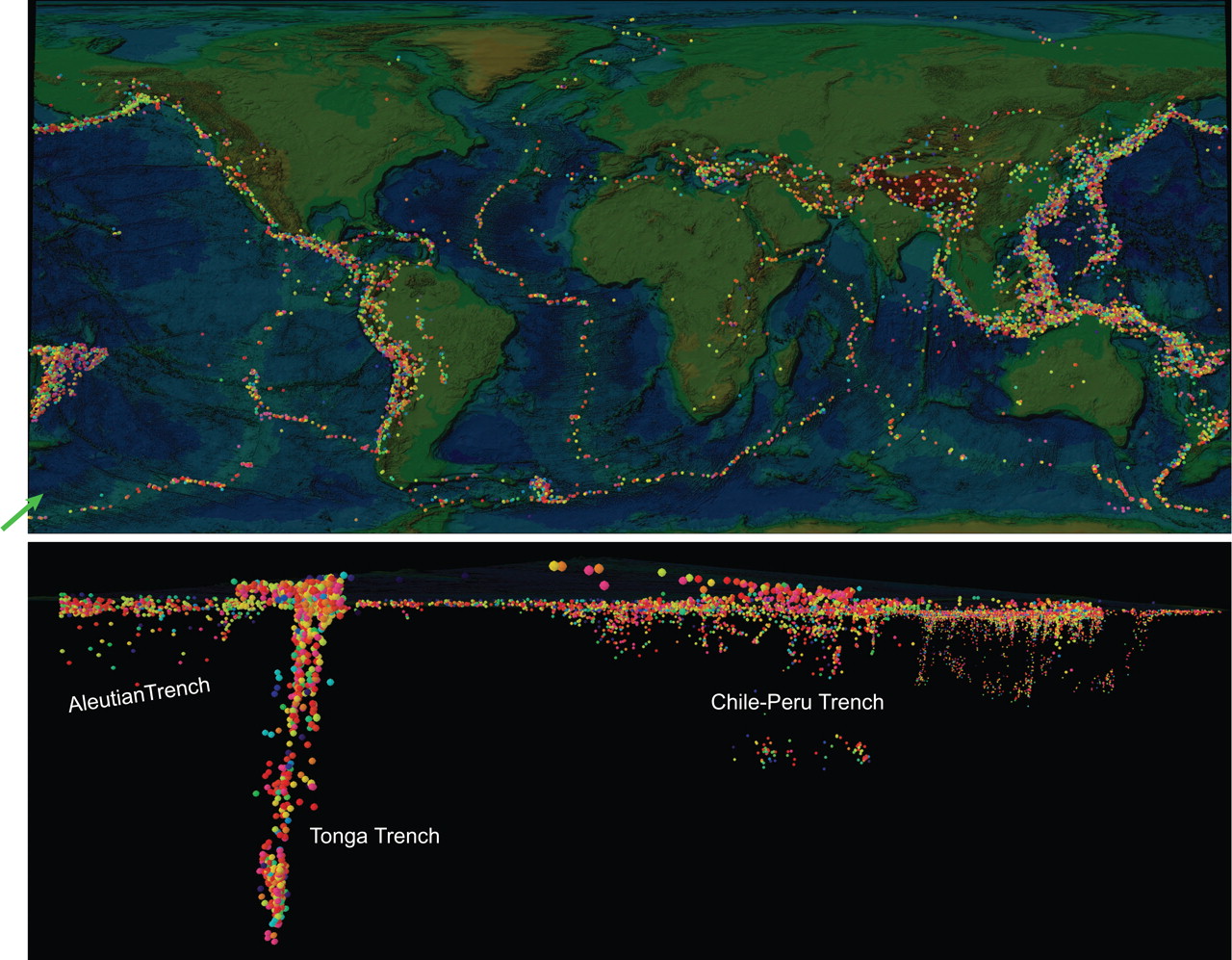
▲ Figure 2. Screen shots of the global earthquake visualization. (A) Bird’s-eye view of the visualization clearly shows that the earthquakes (colored spheres) primarily outline tectonic boundaries. (B) Side view looking in the direction of the green arrow in top figure. Image shows the consistency of seismicity with depth along the full Tonga trench (front left) and the seismicity gap within the Chile-Peru trench. While both features are apparent in this image, the ability to interactively explore this scene file greatly enhances an understanding of global seismicity and allows other features to be identified.
Case Study #2: Geological and Geophysical Data from the Lau Basin (Tonga)
In 2004, we started construction of a 3-D visualization of the Lau basin spreading centers, a Ridge 2000 program study area located in the southwest Pacific Ocean. The general study area covers roughly 860 km x 1,000 km in map view and extends to depths of ~650 km; however, the individual datasets encompass a broad spectrum of spatial scales ranging down to a few meters. The initial integration of bathymetry (Taylor et al. 1996) and processed multichannel seismic (MCS) lines ( Jacobs et al. 2007) provided an opportunity to qualitatively assess the alignment between the along-axis MCS navigation and the bathymetrically defined spreading axes. We formatted each stacked MCS line as an individual visual object. In this way, we used the toggling feature to interactively assess either a specific spreading center or the latitudinal extent of the data, while also choosing to focus on only along-axis data or the along- and cross-axis data (Electronic Supplement Movie 1). The animation provided within Movie 1 highlights the variation in scale presented by the study of back-arc systems, ranging from subduction processes that are measured in scale-lengths between tens to hundreds of kilometers, to ridge crest processes (e.g., petrologic composition/vent chemistry) with scale-lengths ≈1 km. The left pane of Movie 1 represents a 3-D rendering of critical datasets within the Lau back-arc basin, while the right pane views each dataset separately in a manner more consistent with traditional 2-D methodologies. This exploratory process helped confirm that subsurface structural changes are occurring coincident with bathymetric changes, both changing rapidly for the geographic scale of the basin. The ensuing discussion about the ability to visually examine the correlation between these two datasets led us to question what other types of data might mimic this pattern.
From 2004 to 2006, the Lau basin visualization scene slowly expanded to include additional datasets and served repeatedly as a tool for discussion and communication among scientists ( Jacobs et al. 2003). While most frequently used as an end product to produce final summary figures for talks and papers, this visualization was also employed by scientists planning and carrying out shipboard experiments, allowing them to: 1) see the locations and results of previous experiments; and 2) track their own experiment by inputting data directly into the Lau basin scene. As the Ridge 2000 community recognized the value of using integrated visualization techniques for interdisciplinary research, additional scientists contributed their data to help develop a more all-encompassing scene that benefits nearly the entire group in some manner (see Scene 2). Examples of added data include tomographic images (Doug Weins, personal communication.; Zhao et al. 1997), geochemical values (Charles Langmuir, personal communication), bathymetric data (Martinez et al. 2006), hydrothermal vent field and vent temperature information (Baker et al. 2006), and photomosaics of microbial activity (Stacy Kim, personal communication) (Table 2).
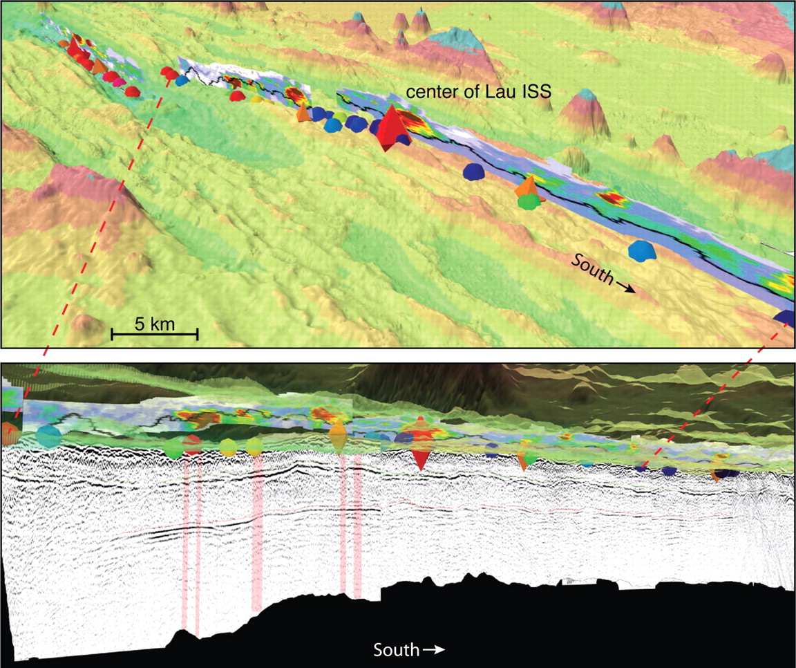
▲ Figure 3. Screen shots of the Lau basin visualization highlighting the integrated study site (ISS) area along the eastern Lau spreading center. (A) The combination of bathymetry (colored by elevation, vertical exaggeration 6X), geochemical data (spheres mark sample sites and are colored by MgO concentration; red is high, black is low), and hydrothermal information (red diamonds indicate explored fields, while orange diamonds are possible fields; multicolored images aligned with the traces of the spreading axes map the concentration of plume-like material in the water column) shows the transitional nature of the region around the ISS. (B) Along-axis multichannel seismic (MCS) data shows a relatively continuous reflection from the interface between the pillow basalts and sheeted dikes (shallower strong reflection traced by a thin green line), while the axial magma chamber reflection does not appear until further south (deeper reflection traced by thin red line). Pink shaded rectangles overlying MCS image show regions where amplitude variation with offset (AVO) analyses suggest the magma chamber is nearly purely molten. The ability to quickly and simultaneously view datasets from the seafloor and the subsurface and recognize linkages between datasets is one of many benefits of using 3-D visualization tools to explore multidisciplinary projects.
A benefit of constructing a scene that combines data from multiple sub-disciplines is that it brings data together into a coherent package while also bringing together specialists from different subdisciplines who might not otherwise collaborate. As each new dataset is added to the scene, a new collaboration is forged, and the community becomes more aware of the interconnections between datasets, many of which were not initially expected. For example, the Lau basin visualization helped us identify a particularly exciting region near 183.8° E, 20.8° S. Here we found that coincidently, the bathymetry rapidly changed from an axial trough to an axial high, the seismic reflection of an axial magma chamber transitioned from being absent to appearing very bright, the geochemistry changed from MORB (mid-ocean ridge basalt)-like to arc-like, and an area of high hydrothermal activity existed above the magma chamber reflection (Figure 3). While scientists generally agreed that these datasets are part of a broader system, the Lau basin scene led to discussions about the timescales that different parts of the system may operate on and where more research needs to be done to better understand the region as a whole. Ultimately, the Lau basin visualization played a key role in the Ridge 2000 community’s choice of the 183.8° E, 20.8° S region as the Lau basin integrated study site (ISS), a sub-area of the larger backarc spreading center where future studies are being concentrated.
Case Study #3: Earthquake Data from Southern California
Next we examine the southern California 2001 Anza magnitude 5.1 and the 2005 Anza magnitude 5.2 mainshock/aftershock sequences. Generally, aftershock sequence data includes positions (latitudes, longitudes, and depths), times, and magnitudes of the mainshock and aftershocks. In regions where a relatively dense network of seismic recording stations exists, earthquake focal mechanisms can also be determined for each earthquake (Reasenberg and Oppenheimer 1985; Hardebeck and Shearer 2002). The focal mechanisms convey information about how the earthquake ruptured in terms of fault orientation (strike and dip) and method of slip (rake). Because of nodal plane ambiguity, each earthquake focal mechanism has two fault planes. One plane is considered the primary fault plane (strike1, dip1, and rake1), and the other is considered the auxiliary fault plane (strike2, dip2, and rake2). When additional information is not available, the primary fault is typically assumed to align with the trend of major faults in the region or mapped surface ruptures and/or with the regional stress field.
Fundamental information for a single aftershock can consist of up to 11 different parameters (latitude, longitude, depth, time, magnitude, two strikes, two dips, and two rakes). For our data set of 827 aftershocks (380 from the 2001 sequence and 447 from the 2005 sequence), this equates to a catalog of 9,097 different data values. To more easily manage these data, we automate the process of transforming the data catalog into a final 3-D visualization scene. The output scene is composed of one or more of the following visual objects: 1) historical earthquakes within a given distance from the mainshock (~10–100 km based on project goals), 2) orbs at each aftershock location that can be color-coded by time and sized by magnitude, and 3) small rectangles oriented to reflect each aftershock’s two fault positions and orientations. The advantage of having such an automated program is that it is easily applied to any mainshock/ aftershock sequence (Nayak and Kilb 2005; Kilb et al. 2006). Currently, we can generate a scene for a new mainshock/ aftershock sequence within an hour of receiving that data. This quick turn-around time is beneficial for constructing visualizations that scientists can use for near real-time analysis, as well as for media, outreach, or classroom use soon after the occurrence of noteworthy earthquakes.
As in our first case study of global seismicity, we use the spatial distribution of seismicity to help identify the location of fault zones. However, because this study region encompasses a much smaller spatial footprint (~ 15 x 15 km within the aftershock zone and ~ 100 x 100 km in the surrounding region of interest), we need to use accurately located earthquake data to discern if a diffuse distribution of seismicity is a true phenomenon or an artifact from errors in the earthquake locations (e.g., Got et al. 1994; Rubin et al. 1999; Kilb and Rubin 2002; Schaff et al. 2002). The southern California Lin-Shearer-Hauksson (LSH) catalog (Lin et al. 2007), which contains data from 1981 through 2005, is based on waveform cross-correlation and cluster analyses. This LSH catalog provides the needed earthquake-to-earthquake relative location accuracies of ~ 10s of meters.
The full LHS catalog currently contains ~ 433,000 earthquakes, and, because of the density of the data, attempting to explore all of these data at once is uninformative. Subsetting the catalog to include only data in our region of interest (longitude: 117° to 116°; latitude: 33° to 34°) creates a more manageable catalog of 72,280 earthquakes. Nonetheless, these data need to be depicted as points (not larger objects such as spheres or cubes) so that clusters of closely located earthquakes don’t meld together into a featureless blob. By exploring these simple point-data with our interactive visualization tools (i.e., rotation, zoom, pan, and toggle), we confirm that seismicity in southern California is very diffuse, compared to the central San Andreas where earthquakes delineate a narrow plane (e.g., Parkfield). We find that there is no dominant fault in our study region, and that multiple strands of faults (e.g., the San Jacinto fault, the Buck Ridge and Clark faults) must accommodate the plate tectonic motions (Fletcher et al. 1987; Vernon 1989). With the help of 3-D visualization, we also see that many of these fault structures are non-vertical, dipping to the northeast.
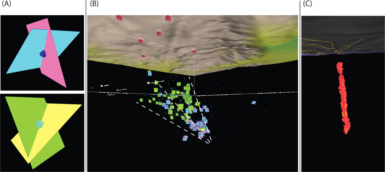
▲ Figure 4. Exploring the spatial extent of seismicity within southern California Anza 2001 and 2005 aftershock sequences. (A) We denote each aftershock location with dark blue orbs for the 2001 sequence and light blue orbs for the 2005 sequence. To help estimate fault complexity we also include rectangles that represent the two nodal planes of the aftershock focal mechanisms. We assume the plane that best aligns with the trend of the San Jacinto fault is the primary fault. We color the primary fault plane pink and the auxiliary plane light blue for the 2001 events. Similarly, for the 2005 sequence, the planes are green and yellow, respectively. (B) Aftershocks of the 2001 and 2005 Anza sequences map out a wedge-shaped volume that extends to a depth of ~ 20 km. Dashed white guidelines outline the location of the wedge. (C) Unlike the Anza data, fault orientations of aftershocks from the 1984 Morgan Hill M 6.2 aftershock sequences, which span a portion of the Calaveras fault in Northern California, are spatially confined to a single ~ vertical fault plane (Kilb and Hardebeck 2006).
Having established the general geometric characteristics of faults in the southern California region, we next focus specifically on the Anza mainshock/aftershock data. We assume the primary nodal plane of each aftershock aligns with the trend of the San Jacinto fault and that the other plane is the auxiliary plane. Using two different colors to differentiate the primary nodal plane from the auxiliary plane (Figure 4A), we estimate how many of the fault planes run parallel to each other. The final result is chaotic, primarily consisting of a wedge-shaped volume of seismic activity (Figure 4B). By toggling the primary and auxiliary planes on and off, we confirm that the orientation of the fault systems within the wedge-shaped volume has minimal conformity. Our 3-D visualization tools (Table 3; Scene 3) allow us to more confidently conclude that aftershocks in the 2001 and 2005 Anza sequences map out a wedge-shaped volume that thins with depth and is composed of very heterogeneous faults. Seismically active wedges have been observed in other regions (Guzofski et al. 2007), although this observation is not always the norm. Many locations in California exhibit aftershocks that map out a very narrow and roughly vertical plane (Kilb and Hardebeck 2006), such as the Morgan Hill region along the Calaveras fault and the earlier mentioned Parkfield region along the San Andreas fault (Figure 4C).
Case Study #4: Seismicity and GPS Data from Lake Tahoe
Our final case study focuses on how 3-D visualization can assist in disseminating research results that extend beyond what can be conveyed with standard 2-D plots. Seismic analyses done by Smith et al. (2004) in the Lake Tahoe, California-Nevada, region show a short, burst-like sequence of deep seismicity starting on 12 August 2003 at ~30 km depth. This activity is especially prominent because the depths are ~15 km deeper than the typically recorded seismicity in the area. Coincident with this deep seismicity was 10 mm of anomalous uplift motion recorded at a GPS station on Slide Mountain, 18 km away from the deep swarm. The unique location of the earthquake cluster is strikingly apparent when viewed within a single 3-D visualization as compared to a series of maps, histograms, or point-plots (Scene 4). The interactive tools associated with the visualization facilitate exploring the large-scale and small-scale relationships, thus providing an opportunity to better grasp the nature of the deep seismicity and where it occurs within a regional context. From any 2- or 3-D figure showing time versus depth of the swarm seismicity, one can see that the 1,161 earthquakes within the deep cluster exhibit a temporal evolution that proceeds from a depth of 33 to 29 km over the first 23 days of the sequence. The work of Smith et al. (2004) conjectures that the domino effect of earthquake rupture, and a 10-mm concomitant rise of Slide Mountain documented by GPS, results from the movement of magma from deep to shallow depths. By viewing the data in simple 2-D graphs of time versus latitude, longitude, and number of events, we qualitatively divide the data into five logical segments that appear to represent “sub-processes,” such as changes in the seismicity rate or spatial extent of the earthquakes (Figure 5A). To further explore the spatial/ temporal behavior of this deep seismicity, we transform the data within each of the five segments into separate visual object files and include them in our visualization scene of the Lake Tahoe region (see Scene 4). By interactively toggling on/off each subprocess object, we confirm the temporal evolution of the seismicity from deep to shallow depths and highlight how the distinct zones progress within the space and time boundaries. The 3-D perspective also exposes many small variations in the seismicity’s migration, including some relatively deep earthquakes that began on day 85 with a slow rate of occurrence, followed on day 100 by a relatively high rate of seismicity (Figure 5B).
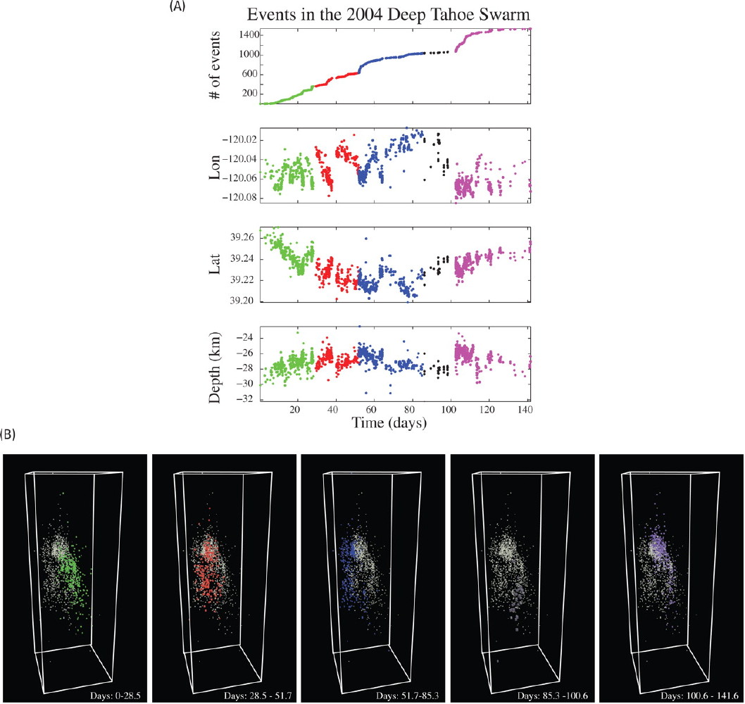
▲ Figure 5. Using 2-D and 3-D methods to examine the spatial and temporal extent of a seismicity burst in the Lake Tahoe, California- Nevada, region. (A) Using 2-D point-plots of earthquakes in the deep 2003 sequence, five subgroups of earthquakes are assigned a particular color-code. The first (red) and second (green) groups demark spatial changes of the earthquakes; the third (blue) group corresponds to a rate change; the fourth (black) group signifies a decrease in the rate of seismicity; and the fifth (magenta) group, primarily a rate change, although a depth change is also apparent. (B) Color-coding and data segmentation as reflected in Figure 5A, but the data are represented in a 3-D perspective using a 2.5× vertical exaggeration. (Continued below.)
In June 2004, a second, burst-like sequence of seismicity was recorded consisting of 793 earthquakes (von Seggern et al. 2008). This swarm was not as deep as the 2003 swarm, occurring within the upper ~15 km, a depth range typical for the region. To better understand the spatial relationships between the two swarms, we add the locations of the 2004 earthquakes to our Lake Tahoe visualization scene file. Quickly apparent is the fact that the 2004 swarm lies directly above the shallowest part of the 2003 swarm, strongly suggesting a relationship between the two events. We further explore this relationship by incorporating information pertaining to the fault orientation of each earthquake into our scene file. This is done by estimating the strike and dip of the individual faults within the two swarms, using the general trend of the localized seismicity. Using this method we assume events in the first deeper swarm (Figure 5C, magenta) have a strike of 95° and a dip of 40°, whereas those in the second swarm (Figure 5C, green) are oriented more vertically with a dip of 80° and strike of 20°. By combining these fault orientations with each earthquake’s location in the Tahoe visualization, we can more easily judge theories about the earthquake source physics of these swarms. For example, one hypothesis suggests that the overlying secondary swarm is associated with seismically generated elastic strains, whereas a second hypothesis proposes that the swarm results from transport of magma through the weak lower crust into the brittle mid-crust. Although the latter scenario may seem less likely, the exact geographic juxtaposition between the mid-crustal swarm and the shallowest, up-dip extent of the deeper swarm provides some evidence for the possibility that magma may have migrated to mid-crustal levels through the weak lower crust. Also supporting the second theory, some of the hypocenters in this swarm are concentrated in a narrow pipe-like volume (von Seggern et al. 2008).
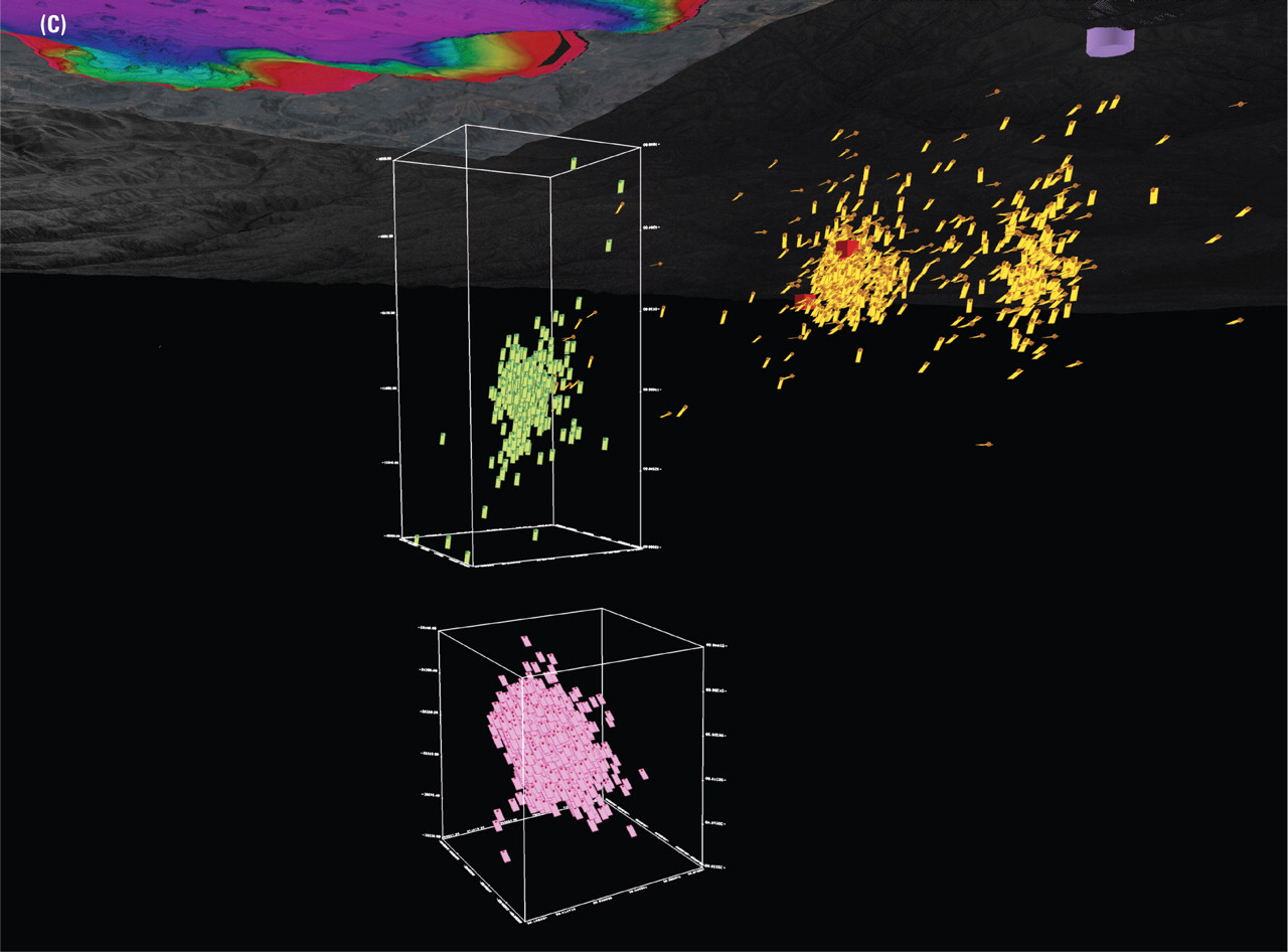
▲ Figure 5 (continued). (C) Snapshot of the Tahoe scene file that includes the deep 2003 burst of seismicity (pink fault planes) and the 2004 swarm (lime green fault planes). Seismicity (gold) below Slide Mountain has no temporal signal associated with the deeper swarm; two M 4 events beneath Slide Mountain (red cubes) in 2004–2005 are also highlighted. Snapshot was taken looking approximately northwest from a vantage point ~ 15 km below Lake Tahoe (rainbow colors in upper left corner). A lavender cylinder in the upper right corner of the image denotes the GPS monument at Slide Mountain.
While this study can succeed without the 3-D visualization component, this example shows how relatively simple data (latitude, longitude, depth, time, and magnitude) are understood on a greater level (with little time involved) when the tools used to explore the data are multidimensional and interactive. Moving between the 2- and 3-D representations of the data assists researchers and readers in better grasping the spatial/ temporal evolution of data.
ADVANTAGES, CHALLENGES, AND THE FUTURE OF VISUALIZATION IN THE GEOSCIENCES
Technological advances in computing and visualization capabilities are greatly increasing the tools available for scientists to understand multidimensional data and explore interdisciplinary research areas. The benefits that exploration through interactive, 3-D visualizations provides include: 1) combining data from different disciplines within the geosciences (e.g., seismology, biology, chemistry, and physics); 2) exploring complex data sets that are difficult to understand using only simple cross-sections, point graphs, and/or histograms; 3) quality control of geo-referenced data; 4) experiment/research planning; and 5) exploring data with spatial scales that span many orders of magnitude. Combined, these benefits show that scientists, particularly those involved with interdisciplinary research, should add 3-D visualization to their toolbox of methods for scientific analysis.
For studies that involve multiple disciplines with complex multidimensional data, or for describing a project to those without an intimate knowledge of the data, visualization tools are vital in presenting scientific data and conclusions. Short tutorial sessions at meetings or workshops, and having the software of choice available for attending scientists to test-drive, also promotes the use of visualization technologies in the community. Currently, many publications (including this one) accept electronic supplements with manuscripts, which provide a great venue for readers to explore the benefit of using visualizations in research. As with any new technology, publicizing the successes of 3-D visualization encourages scientists to become involved in using the available new technologies.
Regardless of the current success with visualization tools, challenges still remain with mainstreaming these tools into the general scientific community. Some of the main challenges include: 1) motivating a larger percentage of scientists to tackle the steep learning curve necessary to easily and efficiently use visualization in their research; 2) finding the best low-cost software that handles 1-D, 2-D, 3-D, and 4-D geoscience data, is capable of volume rendering, and includes an associated free “viewer”; 3) incorporating a method for logging the metadata associated with each visual object, as well as “locking” the objects containing data still under proprietary hold; and 4) improving Internet accessibility to visualizations, including handling the large file sizes of final products. Although forward progress has been made on many of these issues, an ultimate solution has not been realized.
The future of visualization in the geosciences relies on technical enhancements to software packages. Based on our experiences, we have found that a need remains to combine volume data (surfaces and voxels) with 2-D and pseudo-3-D data, and interpolate pseudo-3-D data to create pseudo-volumetric data. As data collection is enhanced with advancing technology, older point data needs to continue to be integrated with the new scene. Additionally, a critical feature necessary to advance the use of visualization is to find a way to include metadata for every visual object and scene. This could be done within the visualization or by accessing a Web database. With this capability, we expect an increase in users because the community can track the evolution of the data and know who is responsible for each data subset.
Assuming a quorum of scientists is interested in including 3-D visualizations in its work, the next key aspect to address is developing easy access to what has already been created, identifying the creators, and then unifying the visualization tools/formats in use (e.g., software packages). At the Scripps Institution of Oceanography’s Visualization Center, we provide an online download library containing visualizations constructed in association with Scripps researchers, each with a description of the data. Currently ~150 items are in our library, including scene files, movies, and online interactive tools. The majority of our visualizations are created using the IVS Fledermaus software package (including the four sample scenes in this paper), allowing us to easily combine objects to develop new scenes. While we do not advocate that this be the central repository for visualizations, a database like this would benefit the scientific community. We expect that getting visualization into the mainstream of science may merely take another generation. When those who grew up with video games become scientists, or assist scientists, we expect visualizations will accompany the majority of geoscience studies. ![]()
ACKNOWLEDGMENTS
We thank Kim Olsen for his helpful review of this manuscript and Luciana Astiz for her assistance as SRL editor. The following National Science Foundation (NSF) awards provided funding for this research: Ridge 2000 award OCE 0424896, EarthScope award EAR 0545250, LOOKING award OCE 0427974, and OptIPuter award ANI-0225642. Discussions with Jeff Dingler greatly improved this manuscript. We thank Tom Im for helping create the Lau Basin movie, Alex Quan for assistance with documenting the visual objects within each scene, and Judy Gaukel for her editorial assistance. The COSMOS 2006 students—Angie Pettenato, Erica Rios, and Shoua Yang—put together the original Global Earthquakes scene. We thank contributors to the Lau basin scene— Brian Taylor, Fernando Martinez, Doug Weins, Charles Langmuir, Stacy Kim, and Ed Baker—and credit the RIDGE 2000 office for frequently using the scene. Earthquake swarm data for the Lake Tahoe scene were provided by Ken Smith and David von Seggern. We thank those who collect, analyze, and catalog the ANZA seismic network data, and Kris Walker for the focal mechanism data for the 2001 and 2005 Anza sequences. This paper was published with the generous support of BP North America.
REFERENCES
Baker, E. T., J. A. Resing, S. L. Walker, F. Martinez, B. Taylor, and K. Nakamura (2006). Abundant hydrothermal venting along melt-rich and melt-free ridge segments in the Lau back-arc basin. Geophysical Research Letters 33, L07308; doi:10.1029/2005GL025283.
Dzwinel, W., D. A. Yuen, K. Boryczko, Y. Ben-Zion, S. Yoshioka, and T. Ito (2005). Nonlinear multidimensional scaling and visualization of earthquake clusters over space, time and feature space. Nonlinear Processes in Geophysics 12 (1), 117–128.
Engdahl, E. R., R. van der Hilst, and R. Buland (1998). Global teleseismic earthquake relocation with improved travel times and procedures for depth determination. Bulletin of the Seismological Society of America 88, 722–743.
Engdahl, E. R., and A. Villaseñor (2002). Global Seismicity: 1900–1999, in International Handbook of Earthquake and Engineering Seismology, ed. W. H. K. Lee, H. Kanamori, P. C. Jennings, and C. Kisslinger, part A, chapter 41, 665–690. San Diego: Academic Press.
Fletcher, J., L. Haar, T. Hanks, L. Baker, F. Vernon, J. Berger, and J. Brune (1987). The digital array at Anza, California: Processing and initial interpretation of source parameters. Journal of Geophysical Research 92, 369–382.
Got, J. L., J. Frechet, and F. W. Klein (1994). Deep fault plane geometry inferred from multiplet relative relocation beneath the south flank of Kilauea. Journal of Geophysical Research 99, 15,375–15,386.
Guzofski, C. A., J. H. Shaw, G. Lin, and P. M. Shearer (2007). Seismically active wedge structure beneath the Coalinga anticline, San Joaquin basin, California. Journal of Geophysical Research 112, B03S05; doi:10.1029/2006JB004465.
Hardebeck, J. L., and P. M. Shearer (2002). A new method for determining first-motion focal mechanisms. Bulletin of the Seismological Society of America 92, 2,264–2,276.
Houston, H. (2007). “Deep Earthquakes,” in Treatise on Seismology, ed. H. Kanamori and G. Schubert (Elsevier), 321–350.
Jacobs, A. M., A. J. Harding, and G. M. Kent (2007). Axial crustal structure of the Lau back-arc basin from velocity modeling of multichannel seismic data. Earth and Planetary Science Letters; doi:10.1016/j. epsl.2007.04.021
Jacobs, A. M., A. J. Harding, G. M. Kent, and J. A. Collins (2003). Alongaxis crustal structure of the Lau back-arc basin from multichannel seismic observations. Eos, Transactions, American Geophysical Union 84, Fall meeting supplement, abstract B12A-0728.
Kent, G. M., S. C. Singh, A. J. Harding, M. C. Sinha, J. A. Orcutt, B. J. Barton, R. S. White, S. Bazin, R.W. Hobbs, C. H. Tong, and J. W. Pye (2000). Evidence from three-dimensional seismic reflectivity images for enhanced melt supply beneath mid-ocean-ridge discontinuities Nature 406 (6796), 614–618.
Kilb, D., and J. L. Hardebeck (2006). Fault parameter constraints using relocated earthquakes: A validation of first motion focal mechanism data. Bulletin of the Seismological Society of America 96, 1,140– 1,158.
Kilb, D., A. Jacobs, A. Nayak, and G. Kent (2006). 3-D visualization of Tonga earthquake. EOS, Transactions, American Geophysical Union 87 (19). doi:10.1029/2006EO190004.
Kilb, D., and A. Nayak (2006). Scientific visualizations of multidimensional data from USArray. IRIS Newsletter 3, 10–11.
Kilb, D., and A. M. Rubin (2002). Implications of diverse fault orientations imaged in relocated aftershocks of the Mount Lewis, ML 5.7, California, earthquake. Journal of Geophysical Research 107, article no. 2294.
Koua, E. L., A. Maceachren, and M. J. Kraak (2006). Evaluating the usability of visualization methods in an exploratory geovisualization environment. International Journal of Geographical Information Science 20, 425–448.
Lin, G., P. M. Shearer, and E. Hauksson (2007). Applying a 3D velocity model, waveform cross-correlation, and cluster analysis to locate southern California seismicity from 1981 to 2005. Submitted to Journal of Geophysical Research.
Martinez, F., B. Taylor, E. T. Baker, J. A. Resing, and S. L. Walker (2006). Opposing trends in crustal thickness and spreading rate along the back-arc eastern Lau spreading center: Implications for controls on ridge morphology, faulting, and hydrothermal activity. Earth and Planetary Science Letters 245, 655–672.
Nayak, A., A. A. Chien, A. Chin, D. Hutches, S. Jenks, G. Kent, D. Kilb, S. O’Connell, M. Okumoto, J. Orcutt, N. Taesombut, E. Weigle, and X. Wu (2005). Scientific collaboration with parallel interactive 3D visualizations of earth science datasets. iGrid, September 2005. http://www.igrid2005.org/
Nayak, A., and D. Kilb (2005). 3D visualization of recent Sumatra earthquake. Eos, Transactions, American Geophysical Union 86, 142.
Reasenberg, P., and D. Oppenheimer (1985). FPFIT, FPPLOT, and FPPAGE: Fortran Computer Programs for Calculating and Displaying Earthquake Fault-plane Solutions. USGS Open File Report 85-739.
Rubin, A. M., D. Gillard, and J. L. Got (1999). Streaks of microearthquakes along creeping faults. Nature 400 (6745), 635–641.
Schaff, D. P., G. H. R. Bokelmann, G. C. Beroza, F. Waldhauser, and W. L. Ellsworth (2002). High-resolution image of Calaveras fault seismicity. Journal of Geophysical Research 107, article no. 2186.
Schwehr K., C.L. Johnson, D. Kilb, A. Nayak, C. Nishimura (2005). Visualization tools facilitate geological investigations of Mars exploration rover landing sites. IS&T/SPIE, Paper Number 5669-15.
Singh, S. C., A. J. Harding, G. M. Kent, M. C. Sinha, V. Combier, S. Bazin, C. H. Tong, J. W. Pye, P. J. Barton, R. W. Hobbs, R. S. White, and J. A. Orcutt (2006). Seismic reflection images of the Moho underlying melt sills at the east Pacific rise. Nature 442, 287–290; doi:10.1038/ nature 04939.
Smith, K.D., D. von Seggern, G. Blewitt, L. Preston, J. G. Anderson, B. P. Wernicke, and J. L. Davis (2004). Evidence for deep magma injection beneath Lake Tahoe, Nevada-California. Science doi: 10.1126/ science.1101304.
Taylor, B., K. Zellmer, F. Martinez, and A. Goodliffe (1996). Sea-floor spreading in the Lau back-arc basin. Earth and Planetary Sciences Letters 144, 35–40.
Vernon, F. L., III (1989). Analysis of data recorded on the ANZA seismic network. PhD diss., University of California, San Diego.
von Seggern, D. H., K. D. Smith, and L. Preston (2008). Seismic spatialtemporal character and effects of a deep (25–30 km) magma intrusion below north Lake Tahoe, California-Nevada. Bulletin of the Seismological Society of America 98, doi: 10.1785/0120060240.
Zhao, D., X. Yingbiao, D. A. Weins, L. Dorman, J. Hildebrand, and S. Webb (1997). Depth extent of the Lau back-arc spreading center and its relation to subduction processes. Science 278, 254–257.
[ Back ]
Posted: 11 November 2008